Recently in typography Category

Hadassah copyright infringement

I heard elements of this case back when I was in Israel this past December. I wish I understood more—whether or not Friedlander gave up the rights to Hadassah and made it public domain back in the 1950s or not, how long does copyright extend? Beyond the law, to what extend did or should Tvika Rosenberg owe Friedlander or his heirs, regardless? In any event, a Jerusalem court ruled last week that Friedlander's granddaughter owns the rights, and that Masterfont, Rosenberg's company, owes. Here are the details from Ha-aretz.

Court: Inventor's heirs own Hadassah Hebrew typeface: Daughter of man who designed classic font about 70 years ago victorious in copyright infringement suit, by Yuval Saar

… In 2009, Hannah Tal filed a NIS 4.5 million copyright infringement suit against the Israeli company Masterfont for selling the popular typeface created by her father, Henri Friedlaender, for many years without her consent. Ayala Tal, Hannah Tal's daughter and Friedlaender's granddaughter, works at Haaretz as a graphic artist…. [more]

A book on Hebrew Typography? What would it contain?

I have just finished reading the marvellous book by Adina Hoffman and Peter Cole on the Cairo Genizah, Sacred Trash. I am also busy at work (again, but perhaps this time with actual visible results to come soon) on a new website on Hebrew Typography. While such a site should contain an active blog (as this one does not, but could), it should also contains information that, like the many shards found in the Genizah, is not available elsewhere and needs to be assembled into a coherent whole. If I could tell that story as well as Hoffman and Cole have illuminated both the process of exploring the hundreds of thousands of Genizah artifacts, and what we have learned from them, it would be a big deal.

Unfortunately, while I have been quite facile with web technology this past decade or so, I find my memories of Hebrew type in need of refeshment. So, what should such a site cover?

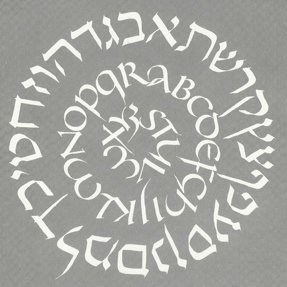
  • Hebrew lettering—obviously, some discussion of Hebrew letterforms, including the early "chicken scratches" used until (if we assume that Birnbaum is still authoritative on this subject) the first exile. A few words at least on mystic traditions attached to the forms? Obviously, some space on the various calligraphic styles that have developed over the past two or three thousand years
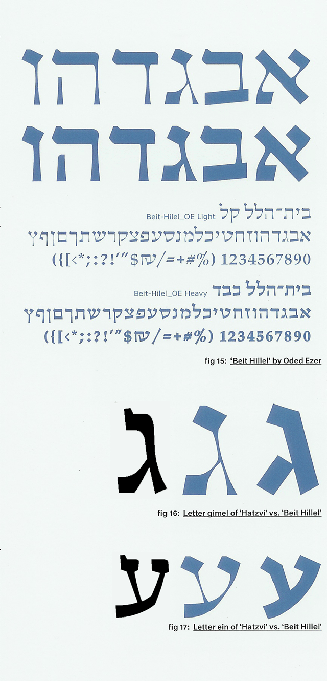
  • Hebrew printing—we start in Italy with the earliest printers, then on to Soncino (credit Griffo?) and Bomberg and how Bomberg's Talmud really changed how we study Talmud--is this the first time we got the hypertext layout? Then on to early European types, the "Yiddish types" (Ittai Tamari has done great research on this subject, but only in German--has he published in English? Then there is Herbert Zafren's work), the great Hebrew types of the Middle Ages--Le B^eacute;, Kis, Van Dyke (not convinced); certainly spend time on the early 20th century with Frank-Ruehl, Chaim, etc.; then the great Israeli explosion of the 1950s (more of less--start w/Koren which is earlier, but then types of David, Narkis, Friedlander, Yarkoni); modern Israeli type--there is some wonderful work happening, both traditional and avant garde--note Oded Ezer)
  • Multilingual typography—The difference between what we are used to seeing (dueling languages and straight, opposite margins), and what thoughtful typographers do to ensure usability, grace, and readability (how/when to position Hebrew, transliteration, translation in reference to each other and examples that make the case that paying attention makes a difference. This, of course, is my own favorite subject. Should also be some notes on appropriate sizing of say Latin U/lc and Hebrew w/ or w/o vowels.
  • Technology?—It may be worth inserting something somewhere about the difficulty of setting Hebrew with nikud, trup, etc., from the setting of separate lines in the metal, to the various compromises used in modern systems, if only to help explain why there are some things that require special software (or lots of time and effort in cold metal), so that people know what the problems are and when to look where for solutions.

Does this make sense? What am I missing (or including, pointlessly)? What are sources to which such a series of writings must refer? (by which I mean not just the Birnbaum volumes or Friedlander's booklet on designing Hadassah, but, say, the Porro polyglot)

Until I fix this blog (coming, I hope), just email me comments.

The Book Jackets of Ismar David

I had the good fortune to meet Ismar David a couple of years before he passed away and thoroughly enjoyed learning more about the design of his signature "David" typeface from him. Now, the wonderful Misha Beletsky has put together a short monograph on his book jackets. It includes a short essay on the history of book jackets, and a short bio of Ismar David that puts his exquisite calligraphic work in context. The sum total is a lovely diversion and a welcome addition to my bookshelf (although I anticipate sharing it widely, so it may not be on the bookshelf when I go looking for it).

book cover graphic

At $19.95, the book is quite modestly priced. It is available from RIT Cary Graphic Arts Press and other fine vendors.

Book covers by Izak Rejzman

In this month's email from the National Yiddish Book Center is an announcement of a lovely slide show exhibit of Yiddish book covers by Izak Rejzman, executed in the middle of the last century. The landing page also contains some brief biographical remarks.

I wish I had known about this material when I was putting together my Hebrew typography lecture, and will surely use some of them next time I teach that class:

http://www.yiddishbookcenter.org/slideshow/book-covers-by-izak-rejzman

Snapshots from a portfolio - typography of Oded Ezer

Intrigued by Ezra Glinter's enthusiastic, if scantily informed review of the work of Israeli typographer Oded Ezer (A Bubbling Font of Creativity: Oded Ezer and His Hebrew Designs, by Ezra Glinter), I ordered the Israeli designer's recent book, The Typographer's Guide to the Galaxy and had a delightful browse.

Although Ezer has designed several commercial typefaces that I would love to get my hands on an explore, I thought I would focus here on pieces that display his more experimental side. One project described early in the book is a font called "Bet Hillel" intended as an homage and re-imagining/reconstruction of the venerable "Ha-Tzvi" face. I should note that although Ha-Tzvi has fallen out of favor today, it is among the faces I use when I want to evoke a feeling of Israel through the Fifties, even through the Sixties. It is a wonderfully unsubtle monoline expression of "gavriut"—"manliness"—and nicely evokes Uzi ben Gibor. What struck me about Ezer's "Bet Hillel" font, however, is that while the "serifs" (Is this term really appropriate? Is it really the term used by Hebrew typographers to describe the terminating strokes attached to Hebrew letters, as used in one of the articles about Ezer's type included with his book?), anyway, while the serifs follow Ha-Tzvi, the curve and feel of the letters offers homage much more closely to Friedlander's "Hadassah." I have taken the liberty of adding, therefore, a couple of quick scans of Hadassah to a detail grabbed from the book. (Click the excerpt to see a full sample of "Bet Hillel".)

Detail showing Hadassah, Bet-Hillel, Ha-Tzvi

more Commentary on the Koren siddur

From the Jewish music "Blog in Dm": The Koren Siddur on Yedid Nefesh. According to the author, "Hasidic Musician," the version of ידיד נפש goes back to the original manuscript which eliminates some translation difficulties and makes for what he considers to be a more beautiful poem.

Check it out!

Israeli Typographer, Oded Ezer, profiled in The Forward

There is an interesting article about Israeli type designer and artist Oded Ezer in a recent edition of The Forward. Although the author does not appear greatly knowledgeable about Hebrew typography, Glinter is to be commended for writing about the subject, and for conveying the idea that fonts are fascinating.

A Bubbling Font of Creativity: Oded Ezer and His Hebrew Designs
By Ezra Glinter
Published July 22, 2009, issue of July 31, 2009.

New "Koren Siddur" features new face, elegant design

Here is a very good article about the new Koren Siddur, which I now have in hand. It is a beautiful book, and will surely take it's place alongside my treasured Jerusalem TaNaKh.

Prayer Type
How Eliyahu Koren used typography to encourage a new way to pray
BY JOSHUA J. FRIEDMAN

It will come as no surprise that the new siddur was set by Jerusalem typographer Raphael Freeman. It is also one of the rare siddurim not to put English and Hebrew in "dueling" position—instead, the two languages work together, reading out from a common spine.

Many thanks to Josh Friedman for noticing the book and writing about it with some knowledge and depth.

the town of Soncino, today

Budapest-based klezmer Bob Cohen blogs about unkosher food, mostly, but today he managed to combine that activity with a mention of the family museum in Soncino, Italy, where the first Jewish Torah was printed by the family whose name is still synonymous with Jewish printing. One measly photo.

Some reader of this blog should go and do a more extensive photoshoot and writeup of the museum, nu?

A new siddur; a new Haggadah

| 4 Comments

Art Scroll siddur detailFor years I have been under the illusion that many people using word processors and informal tools to create prayer materials "get it", but that official book publishers don't. In fact, it has been a common source of depression for me as I get into discussions with customers, many of whom know Hebrew Typography the way I know davenning (kindly put: complementary ignorance). Customers want their publications to look like the others on the shelf. I can't imagine why. It's a situation that isn't helped by the vogue for "ArtScroll" publications. (I put the name in quotes because ArtScroll:Fine Traditional Hebrew Typography :: Korn:My idea of good rock music, which is to say, it's the sort of loud thing that kids like, but tend to outgrow.)

Hertz spreadWe all know what a typical, modern Hebrew-English siddur looks like. I covered this in an early >entry on siddurim. But, how did we get there? After all, there is no shortage of historical examples (a few are uploaded in my Polyglots Gallery) of how to mix Left-to-Right and Right-to-Left multilingual texts. I happen to be fond of pointing people to the Porro Polyglot, but there are many, many good examples of books made so that the Hebrew and English work together.

New Hebrew Computer Resources: keyboards and type tips

heb/eng sample from my Tu B'Shvat 'toolkit'I have added two new webpages to support the workshops I will be giving at KlezKanada.

If you haven't added Hebrew resources to your computer and you are running Windows NT or later; MacOS, or Unix, then take a look at my Hebrew Keyboard Layouts page. So far, this is most useful to Windows users, but there are resources for most platforms. Let me know if they are helpful, if you find errors, improvements, etc.

In as succinct and short manner as I was able, I have outlined a few very basic type tips: things you absolutely need to pay attention to if you are doing songsheets, CD notes, or whatever. These rules are going to be new to a lot of people, and they will result in texts that look "funny". That's because usability is generally ignored, and most of the multilingual materials being distributed are dreck—that's a technical term that means "opposite of usable". Still, this stuff is very simple. It follows rules that have been used for thousands of years. We're going to have a short workshop, I think, and that's fine. I like to teach the way O'Reilly used to do books: only for as long as it takes to cover a simple subject.

a favorite art nouveau coverWhen I went out the NYBC (www.bikher.org) back in May, I got a lot of help from Associate Director Catherine Madsen who dashed all over the building fetching likely image-able posters, boxes of type, and books. She connected me with the Collections Manager, Aaron Rubinstein, and we agreed that I would come back in August, after he had come back from the Columbia U/YIVO Yiddish institute, and do a round of imaging of "interesting book covers."

Some last minute research at the Brandeis University Library

Sometimes I have a tendency to keep gathering data long after I should be writing and finishing a paper. This is certainly true for the Hebrew type lecture I'll be giving next week at KlezKanada. Today I stopped by the Brandeis University Library, which will be my penultimate bit of research - tomorrow I'm back at the National Yiddish Book Center. Then, it's write and digitize. Oh, and get together the disks with AbiWord and prepare the handout for the workshop folks—the ones who want to use Hebrew on their home computers. In the meantime, rather than focus on a coherent story about Hebrew typography, here are some more bits and pieces, as I encountered them.

Update on the German Hebrew Type Database

I have been confused by the shambles of the German Hebrew Type database website, as referenced by the 2001 paper on the project. To my delight, however, I got Dr. Tamari's new e-mail address and he assures me that the overall site is being redone, and that the database is alive and well at http://fsygs21.inf.fh-koeln.de/HebrewShow/servlet/HebrewShow. This is an amazing page. A wonderful for typophiles. I return to my earlier stated belief that this is the most exciting Hebrew type project currently ongoing.

Hebrew Type Bibliography

Well, I need one to hand out at KlezKanada, so I've put together a basic Hebrew Type bibliography. Feel free to send in suggestions, annotations, etc.

A visit with Lili Wronker

wronker page from Sixty Alphabets, GSA BriemAbout 15 years ago I was relatively new to Hebrew type. A local friend, Briem, suggested that I contact someone he knew in New York who was a wonderful calligrapher, and had even contributed a page to his book, "60 Alphabets".

Little did I know.

Page on Schonfield "New Hebrew Script"

sample of Schonfieldian scriptIn my correspondence with Rabbi Bruce Pfeffer, he happened to mentioned that Hugh Schonfield's book on "New Hebrew Typography" (London, 1932) was impossible to find. What he didn't know, and I didn't know until I went looking for it, is that there is a webpage devoted to this curiosity, in which "... Schonfield ranted about his dissatisfaction with the Hebrew writing system. His complaints included a limited selection of typefaces, the lack of a captial-lowercase distinction, and finding Hebrew type ugly. His solution was to revise how Hebrew was written...."

www.geocities.com/snortar/schonfield.html. Enjoy.

Gill Hebrew sampleSchonfield wasn't alone. In Eastern Europe, during the Hebrew Revival (late 19th century, early 20th) of the Eastern Haskalah (Enlightenment), my memory, from a book read during Young Judaea summer camp in Texas some 35 years ago, is that there were several. And I'll up the ante with this sample of the Hebrew face that Eric Gill designed. According to Moshe Spitzer, in his article, "The Development of Hebrew Lettering" (Ariel, No. 37, 1974), the type was originally cut in stone by Gill. It is actually used for display purposes in Israel today. Clearly, Gill was trying to do for Hebrew what that poor pair of Dutch typographers hired by Peter the Great did for Old Slavonic: Make it look more like Latin.

Looking at Prayer Books

| 3 Comments

In further preparation for the project mentioned a few minutes ago, I took a look at several prayerbooks and offered them to the client so that we could consense on the look and feel that would meet his need. It then occurred to me that it is worth posting the same scans here, with some accompanying discussion.

Ben Shahn's 'Alphabet of Creation'

alphabet of creation
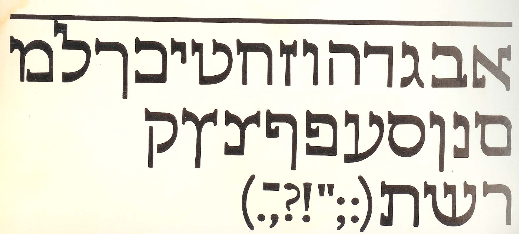
As long as I'm talking about graphic alphabets, I may as well mention Ben Shahn.

Just a beautiful cover

| 1 Comment

periodical coverArnie Perlstein, who I know from Howard Rheingold's Brainstorms community, found this lovely gem while looking for something else: He was exploring the journal itself, "Di Khalyastre," the "gang". There was such an incredible ferment of Yiddish poetry and other writing - plus amazing graphics work - during that period. I think it's my favorite period for type and graphic design, and certainly my favorite period for Yiddish lettering (as opposed, say, to Daniel Bomburg's Talmud, or to the Porro polyglot bible). I wish more people were working with Yiddish during the explosion of punk type in the 1990s. We may simply have to do it now.

In the meantime, if you look at the damn text type on this project, or on others in this archive, it is godawful. The equivalent of Times Roman or worse. But, think about it. To get a new typeface in those days was a fairly lengthy and difficult process (vs. drawing a nice cover). To design a good typeface is still a fairly lengthy and difficult process today, although once the shapes look good, and the sidebearings work, one packages up the digital font and presto. It's not quite the same as creating the matrices for each size for letterpress or hot type and all the rest. We could be living in typographically exciting times.

Yiddish from the National Yiddish Book Center

I love to visit the NYBC periodically to see the slowly changing exhibits, see what is new at the book store, and just wander the wonderful stacks of Yiddish books. Last week my friend Rich called to say that he was driving through and why didn't we meet in Amherst. We had a splendid time and met Catherine Madsen, the Associate Director of the Yiddish Book Department who happily dug up a box of old wooden type (alas, my least favorite variety - that horrid high contrast thick/thin Bodoni-influenced stuff that represented the nadir of Yiddish typography) and a poster for me to photograph. I'll be back for a longer visit later this summer as I prepare for my KlezKanada lecture. I've installed a new image gallery package, qdig, so that I can show up the pictures we took. I'll add more galleries of type photos over time. For now, take a look at our May 17, 2004 visit to the National Yiddish book center.

About this Archive

This page is an archive of recent entries in the typography category.

reference is the previous category.

Find recent content on the main index or look in the archives to find all content.