Intrigued by Ezra Glinter's enthusiastic, if scantily informed review of the work of Israeli typographer Oded Ezer (A Bubbling Font of Creativity: Oded Ezer and His Hebrew Designs, by Ezra Glinter), I ordered the Israeli designer's recent book, The Typographer's Guide to the Galaxy and had a delightful browse.
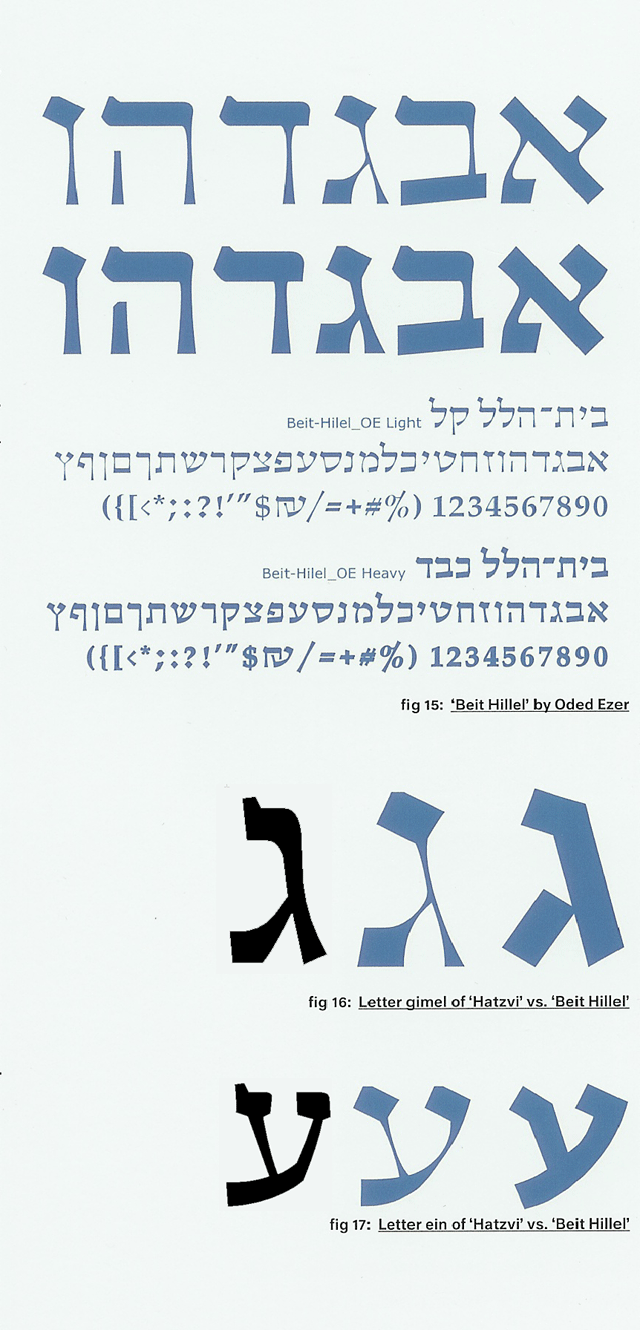
Although Ezer has designed several commercial typefaces that I would love to get my hands on an explore, I thought I would focus here on pieces that display his more experimental side. One project described early in the book is a font called "Bet Hillel" intended as an homage and re-imagining/reconstruction of the venerable "Ha-Tzvi" face. I should note that although Ha-Tzvi has fallen out of favor today, it is among the faces I use when I want to evoke a feeling of Israel through the Fifties, even through the Sixties. It is a wonderfully unsubtle monoline expression of "gavriut"—"manliness"—and nicely evokes Uzi ben Gibor. What struck me about Ezer's "Bet Hillel" font, however, is that while the "serifs" (Is this term really appropriate? Is it really the term used by Hebrew typographers to describe the terminating strokes attached to Hebrew letters, as used in one of the articles about Ezer's type included with his book?), anyway, while the serifs follow Ha-Tzvi, the curve and feel of the letters offers homage much more closely to Friedlander's "Hadassah." I have taken the liberty of adding, therefore, a couple of quick scans of Hadassah to a detail grabbed from the book. (Click the excerpt to see a full sample of "Bet Hillel".)
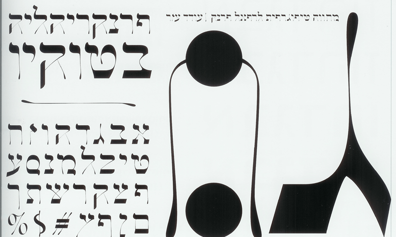
I would also be remiss if I didn't include Ezer's deconstruction of Frank Rühl, the Art Deco face that can not only be said to have moved Ashkenazic Hebrew typography in the direction of readability, but which is as ubiquitous for Hebrew, Ladino, and Yiddish work as the London Times once "New Roman" (it has been replaced by the Times twice in recent decades, a subject for another blog or blog post). Here is a specimen for "Frankrühliah" (created 2001–2003):
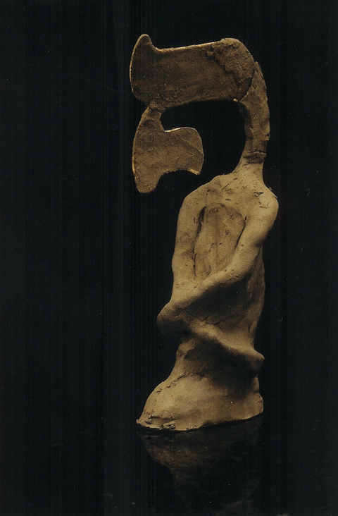
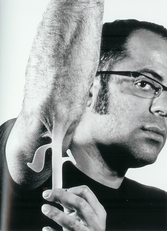 Finally, I want to encourage everyone to get the book to read about, and to feast your eyes on the three-dimensional quality of much of Ezer's work. Here, for instance, is a picture of a piece from "Typo Mythologies" (to my left) and another from "Typoplastic Surgeries":
I also want to add one critical missing bit of information not present in the Forward article, nor in the book: You can find Ezer's work at his website, www.ezerdesign.com