" /> Ari Davidow: Hebrew Typesetter Extraordinaire: August 2004 Archives

« June 2004 | Main | September 2004 »

August 22, 2004

New Hebrew Computer Resources: keyboards and type tips

heb/eng sample from my Tu B'Shvat 'toolkit'I have added two new webpages to support the workshops I will be giving at KlezKanada.

If you haven't added Hebrew resources to your computer and you are running Windows NT or later; MacOS, or Unix, then take a look at my Hebrew Keyboard Layouts page. So far, this is most useful to Windows users, but there are resources for most platforms. Let me know if they are helpful, if you find errors, improvements, etc.

In as succinct and short manner as I was able, I have outlined a few very basic type tips: things you absolutely need to pay attention to if you are doing songsheets, CD notes, or whatever. These rules are going to be new to a lot of people, and they will result in texts that look "funny". That's because usability is generally ignored, and most of the multilingual materials being distributed are dreck—that's a technical term that means "opposite of usable". Still, this stuff is very simple. It follows rules that have been used for thousands of years. We're going to have a short workshop, I think, and that's fine. I like to teach the way O'Reilly used to do books: only for as long as it takes to cover a simple subject.

August 20, 2004

Art Nouveau and Art Deco Yiddish at the National Yiddish Book Center

a favorite art nouveau coverWhen I went out the NYBC (www.bikher.org) back in May, I got a lot of help from Associate Director Catherine Madsen who dashed all over the building fetching likely image-able posters, boxes of type, and books. She connected me with the Collections Manager, Aaron Rubinstein, and we agreed that I would come back in August, after he had come back from the Columbia U/YIVO Yiddish institute, and do a round of imaging of "interesting book covers."

Aaron was great, and he had a huge pile of books to photograph. Catherine also took me down to the basement where I started out photographing boxes of old wooden type. (I have yet to meet anyone at the NYBC, at any level, starting with Aaron Lansky, who hasn't been exceptionally pleasant. The KlezmerShack and this blog will be sponsoring a talk by Lansky at the Newton Jewish Community Center this coming season.) I subjected both of them to a long ramble about some of my recent research, but they were polite and listened.

wooden hebrew typeThe shapes of the wooden type weren't so interesting (that usual awful Modern-type-influenced, somewhat inexpertly cut extreme thick/thin square corner stuff), but there is something about a box full of letters that brings out the inner child—it is the adult equivalent of being given a TaNaKh with raisins scattered among the pages as was done to beginning Kheder students in Eastern Europe.

If you follow the gallery photo spread, you'll see a couple of boxes of wooden type, a quick shot of what my friend, Lila Feingold, described as "everyone's dream basement: shelves and shelves of books in a clean, climate-controlled environment". Then, back upstairs for photographs of a couple of dozen book covers. Most of these are Art Nouveau-ish or Art-Deco-ish. In one case, you'll notice a progression of covers of IB Singer's first novel, "Satan in Goray" through several editions from 1935 through 1972, including the interesting transition of the title page in one edition, which becomes the cover of the next.

awkward cover typeIn a few cases I included pages inside the book. It was interesting to me that, in general, books from Europe (Poland, primarily) used that old high-thick/thin contrast, less-legible type, whereas the then-new Frank-Rühl was more common in the US books. In some cases, I digressed from the typography to note beautiful inside illustrations, and in one case, the use of the then-new Chaim type, a blocky "sans serif" Hebrew that remains popular for display work for this day—then, the first Hebrew type of its kind—for both cover type and for chapter drop caps. Not all of the covers were remarkable for their skill. In one case, I was struck by the way that the person drawing the cover type clearly didn't understand the letterforms, and ended up trying to draw a "nun" that didn't fit with the other letters. It's an oddity. If you look at the bottom of the same cover, you see a wonderful monoline cursive that compares nicely with Izzy Pludwinski's eponymous "Shir", just recently used for a collector's edition of "Song of Songs".

What I haven't found, are bibliophile books—books whose internal typography are as interesting as the covers (see Pludwinski's "Song of Songs," just above). I have often lamented that the flowering of Yiddish literature came during a time when Yiddish (and typography in general) were at a nadir. But I would think that since that time there are, at the very least, art books and letterpress Yiddish somewhere worth sharing, just as there are new, modern papercuts (see below). Of course, those would also tend more to end up in collectors' hands and in museums.

awkward cover typeTo close, I photographed an incredible, locally-cut papercut and then its accompanying explanation (so that I didn't have to write down so many notes), and, of course, one of the many Ben Katchor murals that make up some of the panels in the Book Center. If we're sticking to subject, note his fine Yiddish lettering. If you're just a fan, like me, the drawing style is immediately obvious from his cartoons, and to all, like the NYBC, very welcoming.

I like the NYBC. The center has made a wonderful transition from saving books to helping sponsor new Yiddish and Jewish learning and discussion, and it's just plain "a nice place to visit." Lila loves visiting the Linotype machine, rescued years ago when the Forverts went digital and reconstructed here. You can tell how blasé I've become that I didn't even bother taking yet another picture of that on this visit.

August 18, 2004

Some last minute research at the Brandeis University Library

Sometimes I have a tendency to keep gathering data long after I should be writing and finishing a paper. This is certainly true for the Hebrew type lecture I'll be giving next week at KlezKanada. Today I stopped by the Brandeis University Library, which will be my penultimate bit of research - tomorrow I'm back at the National Yiddish Book Center. Then, it's write and digitize. Oh, and get together the disks with AbiWord and prepare the handout for the workshop folks—the ones who want to use Hebrew on their home computers. In the meantime, rather than focus on a coherent story about Hebrew typography, here are some more bits and pieces, as I encountered them.

YAIHT: Yet Another Introduction to Hebrew Typography

My first stop was to read a copy of yet another "Introduction to Hebrew Typography," this one by Ellic Howe, in Signature 5, 1937. Here I found a kindred soul, who focused less on what books were printed where, but rather on the type, itself, and its context. Howe summarized the situation in Italy, where the earliest Hebrew printing is said to have taken place only a few years after Guttenberg's first efforts and continued sporadically before taking firm root in the 16th century.

What I didn't know (or what hadn't stuck in my head previously) was that Israel Soncino, the first of the Soncino clan, was in business in Soncino, Italy, as a banker. Israel's father, Samuel, had originated from Speyer, in Alsace. The founding of a municipal public loan office put Israel out of business, so he turned to printing with his sons and grandsons. It was the grandson, Gerson, of whom we usually think when we think of the Soncinos. Howe describes him as the greatest of Hebrew printers. Gerson was kept on the run by persecution although, as I noted a few days ago, he also hired Francesco Griffo to cut some of his first punches when Griffo quarreled with Aldus Manutius over not being given credit for creating Aldus' type. In 1497 Soncino went to France. According to Howe, at the time, he was the only Jewish printer in existence. Eventually Gerson took refuge in Turkey, under the Ottomans, where he died broke and bitter. And well he should have felt bitter given what he had been through.

In the discussion of France, Howe mentions the great punchcutter Le Bé I. Most notable is a sample of a display of Hebrew script, cut by Le Bé in 1591, which is based on a cursive form that is very similar to the face we now know as Rashi (and which was used to set the Rashi commentaries in the first printing of the Talmud). My detailed knowledge of Hebrew lettering is sufficiently lacking that it came as a thrill to see this same script existing in France 100 years after it inspired type in Italy.

Of Germany, Howe writes: "There were more typefounders at work in Germany in the Seventeenth century than in any other country, and the great majority of them possessed Hebrew types, which rivalled their roman founts for ugliness." Alas, my limited personal research is in solid agreement.

Hertz spreadAlthough I had known that Holland was a center of Hebrew printing, I hadn't yet put two and two together and realized that this was caused by the centuries during which it was the first refuge of crypto-Jews fleeing Spain and Portugal, a process that began in 1492 (? or earlier? later?) and continued until the eighteenth century. Those familiar with the Hebrew types of Plantin (actually, usually the types of Le Bé) or of Nicholas Kis (the true cutter of many faces once attributed to Janson) will not be surprised. Indeed, I have at hand a Hertz Standard Siddur which uses type clearly based on Le Bé's.

Howe sums up the efforts of these 16th&ndash18th century printers thus (after first noting that most punchcutters were not Jewish, and had no deep knowledge of Hebrew letterforms):

Israeli pocket siddurThe Englishman, the Frenchman, and the Dutchman, at any time between 1600 and 1800, would cut a Hebrew punch in accordance with a national tradition rather than a specifically Jewish tradition. At the end of the eighteenth century, when punchcutters generally were obsessed by the virtuosity of cutting hairlines and beautifully right-angled serifs, they one and all, applied the technique of cutting modern face roman types to their Hebrew founts. The results were disastrous, and Hebrew type design has yet to recover from the effects. (p. 27)

Indeed, you can see from the spread referenced here that this awful contrasty, Bodoni-influenced type still exists. This is from a pocket siddur published in Israel in recent years. We may have a plethora of modern types, but bad type habits persist, like eczema.

sample of Schonfieldian scriptHowe let me down only in the end, where he references a now impossible-to-find book by Hugh Schonfield (in 1937, but recently published, "The New Hebrew Typography." Howe agrees with Schonfield that the old letters should be abandoned and a new Latin-like lettering used. Bah. Humbug.

Bibliographies and books in other languages

from Weinreich letter chartI had a happy time wandering up and down through the Brandeis stacks looking up books by Moshe Rosenfeld, who did some excellent bibliographic references. This material is incredibly valuable for scholars looking to see how printing presses diffused, and the types of materials that were being printed. Rosenfeld's הדפוס העברי מראשיתו עד שנת תש"ח (The Hebrew Press from its beginning through 5708) contains hundreds of poor xeroxes of title pages, in addition to the bibliographic data. From the introduction to that book, I was led to an early Max Weinreich book, "The little black marks" (די שוורצע פינטלעך), which discusses the evolution of the alphabet (including Hebrew) and included this wonderful comparison of Ashkenazic Hebrew typeforms and German Fraktur (click on the thumbnail to see the Fraktur type on top of the chart). I am not the first to notice this similarity. It is, for Hebrew—in my never humble opinion—yet another horrid dead end (see Ellic Howe's comments on the influences of Bodoni-influenced, "Modern" types on Hebrew, above). There is no doubt in my mind that some Latin type ideas have positively influenced modern Hebrew type. But, the best modern Hebrew types, like the best traditional ones, are rooted in Hebrew calligraphy, not Latin in typography.

from Weinreich letter chartAs I wandered up and down five floors of Brandeis stacks, I stopped and enjoyed a wonderful exhibit of the work of Leonard Baskin, primarily known as a sculptor, but also the person behind Western Massachusetts' "Gehenna Press". Baskin's woodcuts are a treat, and it was quite refreshing to spend a few minutes gazing at them and enjoying. Brandeis has put much of the exhibit (but not the picture here) online, at library.brandeis.edu/specialcollections/specialevents/baskin. It is good to be working in a library that doesn't hesitate to remind you that there are wonders beyond one's immediate fixation.

Canaanite to Aramaic: Early letterform politics

Okay, years ago, when Lili Wronker gave me my first lessons in Hebrew Typography, I spent some time with Soloman Birnbaum's "The Hebrew Scripts." One of the impressions that I left with was the extraordinary story of the transition between the original Canaanite letterforms used in pre-Babylonian-exile written Hebrew, and the later Aramaic style of "square letters" that we use now. Modern writers about Hebrew letters (e.g., Ada Yardeni, in The Book of Hebrew Script) note that just as Aramaic became the lingua franca, so too did the Aramaic letterforms. Yardeni also notes that the last examples of the earlier letterforms were found at Massada. Sounds like a simple case of cultural imperialism, much as English has replaced French as the language of diplomacy in much of the world. This visit was to refresh my memory and to take a look, again, at the details of the story, which I remembered as much more surprising.

Indeed, according to Birnbaum, by the time of the return from the Babylonian exile (fifth century BCE?) most secular writing was done using the new square letterforms. But he found it curious that there was a change in the letterforms used for sacred books. Religions, after all, tend to be quite conservative. In some regards, changing the letterforms was as radical an idea as translating the TaNaKh from ancient Hebrew into the then-modern Aramaic. It was also a change that happened relatively quickly. Birnbaum wondered if there were more to the story.

First, he pinpointed the time of the change. The Talmud offers several references to the change. Rabbi Eliezer ben Jacob (2nd half of the 1st century, CE):

Three prophets came with them from the Exile ... One testified that the Torah [scrolls] must be written [in square script].

And R. Yose says:

Ezra was worthy of the Torah being given through him to Israel but Moses [happened to] precede him.... Although the Torah was not given through him, [its] script was changed through him.

So, what gives? Later Christian sources offer independent versions of the story. For instance, Birnbaum cites Epiphanus (ca. 315-403 CE):

The Samaritans, however, retain the deese non, which form, as we have said, was engraved in older times in the stone tablets. But when Ezra came up from Babylon and desired to make Israel different from other peoples in order that the offspring of Abraham should not appear to be defiled by the inhabitants of the land—who have, indeed, the Law but not the Prophets—he changed the previous form, abandoning the deesenon, because that form was already in the possession of the Samaritans, in order that the seed of Abraham should thereby be distinguished from the rest of the nations.

Whew. So, just as Ezra demanded that all Jews from the Holy Land divorce their Samaritan spouses, he also protected the Holy texts by declaring all Holy texts written in the old script "unkosher". It ensured that only Holy texts from Babylonia, or that were written by scribes returning with him from exile, were used and prevented adding post-exilic Samaritan writings to the TaNaKh. Samaritans still use the ancient script.

Interestingly, neither the popularity of Aramaic letterforms for general Hebrew, nor the exclusive use of Aramaic letterforms for Holy texts, meant that the earlier letterforms disappeared immediately. During the Persian period, local Jewish Palestinian authorities used the Canaanite forms for official documents, presumably as a sort of "nationalist" differentiation from the rest of the empire. Coins were also struck locally using the old script.

And then, hundreds of years later, under the Macabbees, that same lettering was used for coinage. According to Birnbaum, this was not because the letterforms were representative of some inner clique that had preserved the Canaanite lettering—that makes no sense given the religious prohibition against using the letters for Holy texts. Indeed, even Bar Kochba's writing (he the leader of the last rebellion against the Romans, the war in which the zealots at Massada committed suicide rather than be captured) is in the square letters. Rather, he suggests, they did it because that was the tradition: they probably made coins just like the coins used last time Jews had been sovereign in Israel. Those coins are the "last known uses of the Canaanite letters for Hebrew writing", and are hundreds of years after such letters were used for anything but coins. And, indeed, modern Israeli coins continue the tradition, so Canaanite letterforms have been reborn. Not.

When I am next solvent, I must find a copy of Birnbaum. There is too much detail here not available in any other general text.

Type in the Service of Politics

And I ended the day looking at some early Israeli posters, this from a book about political art created for Hashomer Hatzair and Mapam in the '50s, אמנות בשרות רעיון ("Art in the service of an idea"), edited by Shlomo Shaaltiel in 1999. Note the homage to the calligraphic slanted end-stroke on many of these letterforms, which typify modern Hebrew of the 1950s. (Today, these are still common themes, but there is also a lot more imitation of Latin display types.)

Ban the Bomb   First National Conference of Arab Pioneer Youth   Mapam - May Day 1949   Proposed layout for World Youth Conference  

August 17, 2004

Update on the German Hebrew Type Database

I have been confused by the shambles of the German Hebrew Type database website, as referenced by the 2001 paper on the project. To my delight, however, I got Dr. Tamari's new e-mail address and he assures me that the overall site is being redone, and that the database is alive and well at http://fsygs21.inf.fh-koeln.de/HebrewShow/servlet/HebrewShow. This is an amazing page. A wonderful for typophiles. I return to my earlier stated belief that this is the most exciting Hebrew type project currently ongoing.

Hebrew Type Bibliography

Well, I need one to hand out at KlezKanada, so I've put together a basic Hebrew Type bibliography. Feel free to send in suggestions, annotations, etc.

August 16, 2004

A visit with Lili Wronker

wronker page from Sixty Alphabets, GSA BriemAbout 15 years ago I was relatively new to Hebrew type. A local friend, Briem, suggested that I contact someone he knew in New York who was a wonderful calligrapher, and had even contributed a page to his book, "60 Alphabets".

Little did I know.

So, prior to my next trip to New York, I contacted Ms. Wronker, who suggested that we meet at the New York Public Library, which was then doing an exhibit on Hebrew ("A Sign and a Witness: 2000 Years of Hebrew Books and Illuminated Manuscripts"). We met. She was a lively person, somewhat past middle-aged, but not remotely old. And, in the hour we spent going through the New York Public Library Exhibit I learned my about Hebrew lettering that I have learned before or since. From micrography to the latest types, Lili could point out the salient points, give them context and description, and quickly move me on, the better to finish up and go back to her place for lunch and an afternoon of book study. This was the sort of place in which Lili and Erich, her husband, even kept a small letterpress in their bedroom.

Lili is still my teacher, although I would also claim that we are also friends. This past week I dropped by to catch up, to tell her about my forthcoming KlezKanada lecture and see the video she has made of her basic "this is Hebrew lettering" lecture. As usual, I left with too damn many good ideas to incorporate at this stage, but also inspired.

page from Gersonides, typeset by Conat, 1480For instance, she reminded me that Francesco Griffo, known to most folks as Aldus Manutius' punchcutter, also cut the first type for the great Italian printer, Gerson Soncino. Aldus was not pleased that Griffo was working with Soncino and kept non-Hebrew commissions from him. Think, too, of Estellina Conat, wife of Rabbi Abraham Conat. The Rabbi was perhaps the first Hebrew printer in Italy, succeeding in printing six books between 1476 to 1480:

The legal code, 'Path of Life' the traveler's tales of Eldad the Danite, the popular version of Josephus, Rabbi Levi ben Gerson's commentary on the Pentateuch, an astronimcal table by Mordecai Finzi and 'The Drippings of the Honeycomb' by Rabbi Judah ben Yehiel, the first Hebrew book published in the lifetime of its author. (from "Makers of Hebrew Books in Italy," David W. Amram, Holland Press:London, 1963)

But here is what is notable. Already with the introduction of Hebrew printing, the good Rebitzen printed a book on her own account ("Investigation of the World," by Jedaiah Bedersi), so that Hebrew printing in Italy was introduced not just by a man, but by both man and woman. Consider that Jewish tradition bars women from writing Torah scrolls and the significance of this partnership in printing Hebrew books becomes even more significant.

She 'wrote' the book, as her husband said, 'with many pens without the aid of miracle,' for the art had not yet invented the word 'printing' (dfus, דפוס ), a term invented by Abraham the Dyer, in 1477, at Ferrara (source: Amram).

from 'Liber Librorum 1955', Ismar David, 'Genesis' (Bereshit)From a sample in her video, I was introduced to an incredible handwriting/calligraphy manual by Israeli calligrapher Noah Ophir, and the late Leila Avrin (whose article in Fine Print 12:1, January 1986, "Acrophonic, Micrographic, Typographic: The Story of Hebrew Letters," is, like her entries on Hebrew Typography in the Encyclopedia Judaica, definitive, wonderfully-illustrated, and clear) that I must purchase asap. Ophir has also done some amazing work with a calligraphy hand based on the same hand used in the Dead Sea Scrolls. Lili also pointed out a plate that has been framed on her wall for years, of a page of Genesis set by the late Ismar David. That it is beautiful goes without saying. It was part of a collection of 42 pages done by the best typographers of the age: Joseph Blumenthal, D. Stempal, Hermann Zapf, Jan Van Krimpen, Joh. Enschede en Zonen, Jan Tschichold, Bruce Rogers, ... in which each solve a typographic problem in setting the bible. Lili's daughter has promised to send me a scan of the print. What is notable, aside from the use of David's eponymous Hebrew face, is that it is also an impeccable example of the beauty of (in my never humble opinion) correct placement of the Hebrew on the left-hand side of the page, starting from a slightly off-set center, and the English on the right-hand side, again, starting slightly off-center (the same text set in both languages will not take up an equal amount of space - the Hebrew line will always average a bit shorter than the English; even moreso if it is Hebrew w/translation - so the designer has to pay attention to the texts and translations of a given work and adjust accordingly). Note the use of the line numbers to pull the Hebrew and English even more closely together. Now, if I can just convince more Hebrew book publishers to follow suit and end the tyranny of dueling alphabets, facing each other, as if in hostility, from opposing farthest reaches of the spread or page.

Getting back to the video, Lili notes that writing (amazing illustrations - I hope that she is persuaded to make it available for general purchase) was invented by the Phoenicians around 1700 BCE (did I write this down correctly?). There were 27 characters. By the time the Hebrews conquered Canaan and inherited the writing system, the number was down to 22 letters.

In Jewish tradition, Hebrew letters are considered sacred, and writing with the name of God cannot be thrown away. It must be buried or stored forever in a room known as a "genizah". This has been a blessing, in a way, because one instance of a genizah, in Cairo, explored by Solomon Schaecter, produced a treasure trove not just of writing samples going back hundreds of years, but actual letters in the hands of such luminaries as Maimonides.

Finally, Matthew Carter, one of the pre-eminent typographers of our age, has designed a Hebrew typeface. I must find time tomorrow, or soon, to call the Carter Cone studios and ask after it. If the font isn't available, perhaps I can get some proofs of the Bible it was used to set for my lectures.

Days spent working with Hebrew, or just in discussing it, are so full and so rich. By me, it is davenning. Sorry for rambling - blame it all on Lili, still an amazing ball of energy and an amazing calligrapher.

August 9, 2004

Page on Schonfield "New Hebrew Script"

sample of Schonfieldian script
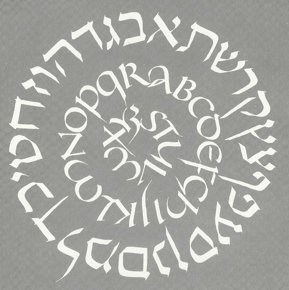
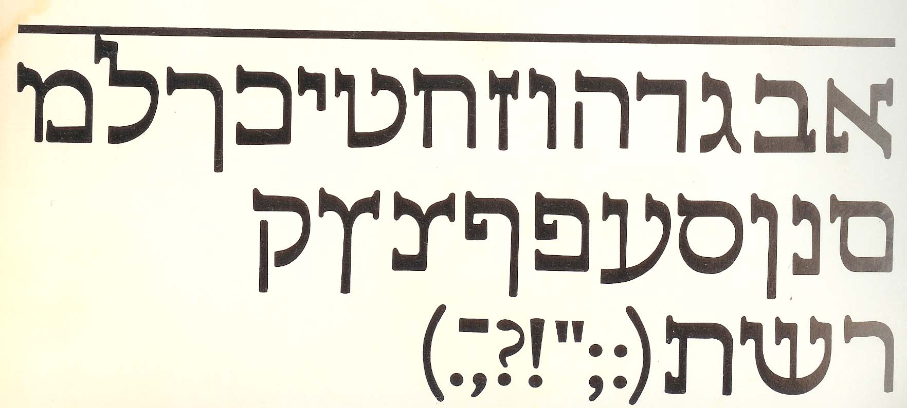
In my correspondence with Rabbi Bruce Pfeffer, he happened to mentioned that Hugh Schonfield's book on "New Hebrew Typography" (London, 1932) was impossible to find. What he didn't know, and I didn't know until I went looking for it, is that there is a webpage devoted to this curiosity, in which "... Schonfield ranted about his dissatisfaction with the Hebrew writing system. His complaints included a limited selection of typefaces, the lack of a captial-lowercase distinction, and finding Hebrew type ugly. His solution was to revise how Hebrew was written...."

www.geocities.com/snortar/schonfield.html. Enjoy.

Gill Hebrew sampleSchonfield wasn't alone. In Eastern Europe, during the Hebrew Revival (late 19th century, early 20th) of the Eastern Haskalah (Enlightenment), my memory, from a book read during Young Judaea summer camp in Texas some 35 years ago, is that there were several. And I'll up the ante with this sample of the Hebrew face that Eric Gill designed. According to Moshe Spitzer, in his article, "The Development of Hebrew Lettering" (Ariel, No. 37, 1974), the type was originally cut in stone by Gill. It is actually used for display purposes in Israel today. Clearly, Gill was trying to do for Hebrew what that poor pair of Dutch typographers hired by Peter the Great did for Old Slavonic: Make it look more like Latin.

August 8, 2004

Looking at Prayer Books

In further preparation for the project mentioned a few minutes ago, I took a look at several prayerbooks and offered them to the client so that we could consense on the look and feel that would meet his need. It then occurred to me that it is worth posting the same scans here, with some accompanying discussion.

Hertz spreadI started with an old friend–the siddur I received at my Bar Mitzvah. This is a page from the venerable Hertz siddur, by Joseph H. Hertz, late Chief Rabbi of the British Empire. How that made its way to Dallas, Texas, I do not know, but it is a wonderful siddur and survives 30 years of occasionally careless use. Many people enjoy it as much for the commentaries and notes as for the service, which is set in a warm setting of a 19th century Hebrew (Vilna?). Not a font I would be likely to use today, but one that does stand up reasonably well to time.

Kol Ha-Neshama spreadNext, take a look at this spread from the "Sim Shalom" siddur. It seems to be popular in the American "Conservative" movement. I find it is reasonably well-produced, and while Friedländer's Hadassah is set a bit loose for my taste, it does go reasonably well with the blocky Zapf Book, also set a bit loose for my taste. Note the excellent use of space, the even color of the pages, the small dingbats, rules, and careful use of small caps that help separate sections. This might be thought of as the "anti-Art Scroll" siddur: tasteful, readable, pleasant, clear, quiet. (Those who have seen ArtScroll productions may have recoiled from the vulgarity and cacaphony of the pages with their plethora of sizes and weights–proof that it Hadassah need not always be a delight to read.)

As was the case with the Hertz siddur, the English is on the verso (left) page, and the Hebrew is on the right. This is opposite how the great polyglot calligraphers and typographers of the preceding few hundred years would have set things up, but it has become standard over the last 100 years. It would not be a bad idea to rethink, although I also confess that I find myself bending to the will of clients frequently, and perpetuating the problem. The thing is, if you are publishing for people who need/desire both English and Hebrew, you want to make it easy on the eye. In this layout, the eye starts at one far edge of the spread, and if looking to see the translation, must jump over the entire width of the spread without losing its place. But, our eyes don't work that way, so most people using this sort of book become subconsciously used to the fact that navigating back and forth requires considerable effort. See the next sample for a better way to arrange things.

Kol Ha-Neshama spreadThe third sample, which is also shown here in miniature, is from the recent (1996) Reconstructionist siddur, "" (Voice of the Soul). The Hebrew is our old friend, Frank-Rühl, which I think of as the "Times Roman" or "Helvetica" of Hebrew - ubiquitous to the point where I try to avoid it. The text is nice and Bembo-ish, if not always sized perfectly. Actually, I find the layout often crowded and clunky, but the really neat thing is that, while this follows the "Hebrew on one page; English on the other" style that is popular in American bi-lingual siddurim, here the Hebrew is properly on the verso (left). In fact, for all that I have complaints about the actual execution of the book, whoever designed this had a nice sense of Hebrew typographic principles. There was also some care taken with the actual font design. Note the word "kol" and the kamatz-katan (or is that kamatz-gadol–it's late at night and suddenly all professional terms have been vanishing).

Metsudah spreadFinally, on a whim I included the "Metsudah" siddur that my wife enjoys. Again, the type is undistinguished, and the Hebrew has traces of the ArtScroll cacaphony with slightly outsized initial words on many sections. But take a look at how the Hebrew and English are organized: They got it half right. The lines are short (deliberately, as I found out from reading the book's introduction), so that the Hebrew and English are on the same line. The breaks are correct, so that the English is the translation of the current line of Hebrew. Here is how the introduction describes it:

The aim of this Siddur is twofold--to afford the suppliant an opportunity to learn and understand the meaning of the words of prayer, and at the same time encourage him to adopt a slower more realistic pace of davening which will also permit him to pronounce each word properly.

We have thus limited each line of prayer to three or four words, each line containing a complete tefila thought. In the new linear design, each translation is on the same line as the Hebrew text, providing the suppliant instant explanation of the words as they are recited....

So, having had such amazing kavana (intent), how badly did they mess up? Well, pretty awfully bad, if you think about it. The Hebrew and English are backwards from where they should be. By putting the English on the left and the Hebrew on the right the designer repeats the common recent mistake. Worse, this means that in whatever language you are reading, your eye always has to hunt for the beginning of the line. This is not my idea of facilitating thought and meditation. It is my idea of a headache. You'll also notice that the Hebrew lines are simply too tight–there isn't enough vertical space between the lines (leading, or line spacing). Phooey. Amateurs. Feh. A bad siddur for davenning.

So, what will my design reflect in this new siddur? I'll have samples when it is all over, but in my mind's eye, I'm going to do something similar to the "Metsudah," but with the Hebrew and English in the correct position relative to each other, and I'll probably use Narkissim or Narkiss Classic for the text, eschewing both the over-worked Frank Rühl and the common, but always welcome in a good rendition, Hadassah.

Quark blows it, again

Or, in my caustic way, I guess I could just say, "Quark blows, again." This isn't even a Hebrew issue.

Working on a new Siddur (prayerbook) project, I decided to create some quick samples of the proposed cover using Quark 4.whatever on my Mac, where most of my fonts reside. I have created a special Hebrew layout for many Hebrew fonts so that, by typing backwards and kerning the vowels into place, I can use them with XPress. What I forgot was that the program doesn't know how to handle OpenType fonts, so when I went to create a PDF to send to the client, I got printing errors. I mention this only because at the recent MacWorld I made a point of stopping by the Quark book and asking if this has been incorporated into the current version. No such luck.

But, I did have a demo of InDesign 2 on the Mac (usually I now use InDesign CS on my Windows machine) which I reinstalled and used to import the Quark file, then to create the desired PDF. Piece of cake.

I wish Quark would do something to make me regret moving on to InDesign and investing in the MiddleEast (i.e., knows how to handle Hebrew) version of same. Actually, maybe I don't wish that, except that I have loved to hate Quark for so many years that it is hard simply moving on with my life and not hassling with the same old issues any more.

New Hebrew Type Blog sponsor

FontWorld logoBack about 15 years ago, the genesis of this weblog was the E-HUG electronic mail newsletter. Originally sent out from my account on the WELL, E-HUG was offered a home at Dartmouth and about 20 issues were sent out around 1990. One of my favorite vendors at the time was FontWorld, run by Mark Seldowitz, who marketed the fonts created by his brother, Israel, who had studied in Israel, the country, with the creator of Hadassah, Henry Friedländer.

FontWorld still sells fonts for just about every world alphabet (including both Hebrew and Arabic fonts). They are also the US source for the Middle Eastern versions of Adobe software (e.g., that version of InDesign that knows from Hebrew and vowels). It is with great pleasure that I announce that they have agreed to sponsor these pages. Their sponsorship gives me an excuse to renew an old friendship, and helps me draw attention to their good work.

Many thanks.