 When I went out the NYBC (www.bikher.org) back in May, I got a lot of help from Associate Director Catherine Madsen who dashed all over the building fetching likely image-able posters, boxes of type, and books. She connected me with the Collections Manager, Aaron Rubinstein, and we agreed that I would come back in August, after he had come back from the Columbia U/YIVO Yiddish institute, and do a round of imaging of "interesting book covers."
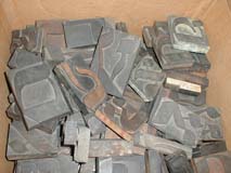
Aaron was great, and he had a huge pile of books to photograph. Catherine also took me down to the basement where I started out photographing boxes of old wooden type. (I have yet to meet anyone at the NYBC, at any level, starting with Aaron Lansky, who hasn't been exceptionally pleasant. The KlezmerShack and this blog will be sponsoring a talk by Lansky at the Newton Jewish Community Center this coming season.) I subjected both of them to a long ramble about some of my recent research, but they were polite and listened.
 The shapes of the wooden type weren't so interesting (that usual awful Modern-type-influenced, somewhat inexpertly cut extreme thick/thin square corner stuff), but there is something about a box full of letters that brings out the inner child—it is the adult equivalent of being given a TaNaKh with raisins scattered among the pages as was done to beginning Kheder students in Eastern Europe.
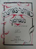
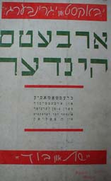
If you follow the gallery photo spread, you'll see a couple of boxes of wooden type, a quick shot of what my friend, Lila Feingold, described as "everyone's dream basement: shelves and shelves of books in a clean, climate-controlled environment". Then, back upstairs for photographs of a couple of dozen book covers. Most of these are Art Nouveau-ish or Art-Deco-ish. In one case, you'll notice a progression of covers of IB Singer's first novel, "Satan in Goray" through several editions from 1935 through 1972, including the interesting transition of the title page in one edition, which becomes the cover of the next.
 In a few cases I included pages inside the book. It was interesting to me that, in general, books from Europe (Poland, primarily) used that old high-thick/thin contrast, less-legible type, whereas the then-new Frank-Rühl was more common in the US books. In some cases, I digressed from the typography to note beautiful inside illustrations, and in one case, the use of the then-new Chaim type, a blocky "sans serif" Hebrew that remains popular for display work for this day—then, the first Hebrew type of its kind—for both cover type and for chapter drop caps. Not all of the covers were remarkable for their skill. In one case, I was struck by the way that the person drawing the cover type clearly didn't understand the letterforms, and ended up trying to draw a "nun" that didn't fit with the other letters. It's an oddity. If you look at the bottom of the same cover, you see a wonderful monoline cursive that compares nicely with Izzy Pludwinski's eponymous "Shir", just recently used for a collector's edition of "Song of Songs".
What I haven't found, are bibliophile books—books whose internal typography are as interesting as the covers (see Pludwinski's "Song of Songs," just above). I have often lamented that the flowering of Yiddish literature came during a time when Yiddish (and typography in general) were at a nadir. But I would think that since that time there are, at the very least, art books and letterpress Yiddish somewhere worth sharing, just as there are new, modern papercuts (see below). Of course, those would also tend more to end up in collectors' hands and in museums.
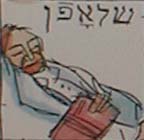
 To close, I photographed an incredible, locally-cut papercut and then its accompanying explanation (so that I didn't have to write down so many notes), and, of course, one of the many Ben Katchor murals that make up some of the panels in the Book Center. If we're sticking to subject, note his fine Yiddish lettering. If you're just a fan, like me, the drawing style is immediately obvious from his cartoons, and to all, like the NYBC, very welcoming.
I like the NYBC. The center has made a wonderful transition from saving books to helping sponsor new Yiddish and Jewish learning and discussion, and it's just plain "a nice place to visit." Lila loves visiting the Linotype machine, rescued years ago when the Forverts went digital and reconstructed here. You can tell how blasé I've become that I didn't even bother taking yet another picture of that on this visit.

As a lover of Hebrew. Of books. Of calligraphy. Of Art Deco. I am overwhelmed and "you made my day!". What beauty. Lashon haKodesh with the artists' emotions! This is certainly on my favorites list and I must visit this basement!
Thanks. The National Yiddish Book Center is truly a treasure. Go visit (or at least become a member). It's a very nice thing to do for yourself, and for Yiddish books.