August 2009 Archives

Snapshots from a portfolio - typography of Oded Ezer

Intrigued by Ezra Glinter's enthusiastic, if scantily informed review of the work of Israeli typographer Oded Ezer (A Bubbling Font of Creativity: Oded Ezer and His Hebrew Designs, by Ezra Glinter), I ordered the Israeli designer's recent book, The Typographer's Guide to the Galaxy and had a delightful browse.

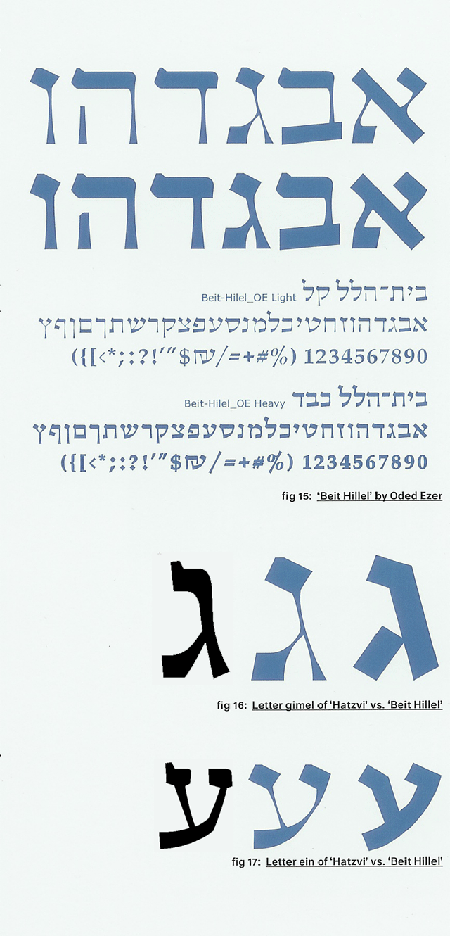
Although Ezer has designed several commercial typefaces that I would love to get my hands on an explore, I thought I would focus here on pieces that display his more experimental side. One project described early in the book is a font called "Bet Hillel" intended as an homage and re-imagining/reconstruction of the venerable "Ha-Tzvi" face. I should note that although Ha-Tzvi has fallen out of favor today, it is among the faces I use when I want to evoke a feeling of Israel through the Fifties, even through the Sixties. It is a wonderfully unsubtle monoline expression of "gavriut"—"manliness"—and nicely evokes Uzi ben Gibor. What struck me about Ezer's "Bet Hillel" font, however, is that while the "serifs" (Is this term really appropriate? Is it really the term used by Hebrew typographers to describe the terminating strokes attached to Hebrew letters, as used in one of the articles about Ezer's type included with his book?), anyway, while the serifs follow Ha-Tzvi, the curve and feel of the letters offers homage much more closely to Friedlander's "Hadassah." I have taken the liberty of adding, therefore, a couple of quick scans of Hadassah to a detail grabbed from the book. (Click the excerpt to see a full sample of "Bet Hillel".)

Detail showing Hadassah, Bet-Hillel, Ha-Tzvi

more Commentary on the Koren siddur

From the Jewish music "Blog in Dm": The Koren Siddur on Yedid Nefesh. According to the author, "Hasidic Musician," the version of ידיד נפש goes back to the original manuscript which eliminates some translation difficulties and makes for what he considers to be a more beautiful poem.

Check it out!

Israeli Typographer, Oded Ezer, profiled in The Forward

There is an interesting article about Israeli type designer and artist Oded Ezer in a recent edition of The Forward. Although the author does not appear greatly knowledgeable about Hebrew typography, Glinter is to be commended for writing about the subject, and for conveying the idea that fonts are fascinating.

A Bubbling Font of Creativity: Oded Ezer and His Hebrew Designs
By Ezra Glinter
Published July 22, 2009, issue of July 31, 2009.

New "Koren Siddur" features new face, elegant design

Here is a very good article about the new Koren Siddur, which I now have in hand. It is a beautiful book, and will surely take it's place alongside my treasured Jerusalem TaNaKh.

Prayer Type
How Eliyahu Koren used typography to encourage a new way to pray
BY JOSHUA J. FRIEDMAN

It will come as no surprise that the new siddur was set by Jerusalem typographer Raphael Freeman. It is also one of the rare siddurim not to put English and Hebrew in "dueling" position—instead, the two languages work together, reading out from a common spine.

Many thanks to Josh Friedman for noticing the book and writing about it with some knowledge and depth.

About this Archive

This page is an archive of entries from August 2009 listed from newest to oldest.

July 2008 is the previous archive.

September 2009 is the next archive.

Find recent content on the main index or look in the archives to find all content.