" /> Ari Davidow: Hebrew Typesetter Extraordinaire: April 2005 Archives

« March 2005 | Main | July 2005 »

April 27, 2005

Judaica at the Library of Congress

A friend forwarded the URL for an interesting online Judaica encyclopedia, the Jewish Virtual Library. The information is broken into small chunks at times, and like all encyclopedias there is often just enough to whet your appetite, but not enough to answer questions. Still, take a look at the Library of Congress holdings detailed at the Jewish Virtual Library and enjoy. There is enough there to get a sense of Hebrew books and printing and want to learn more.

April 18, 2005

Updated Passover Haggadah Toolkit

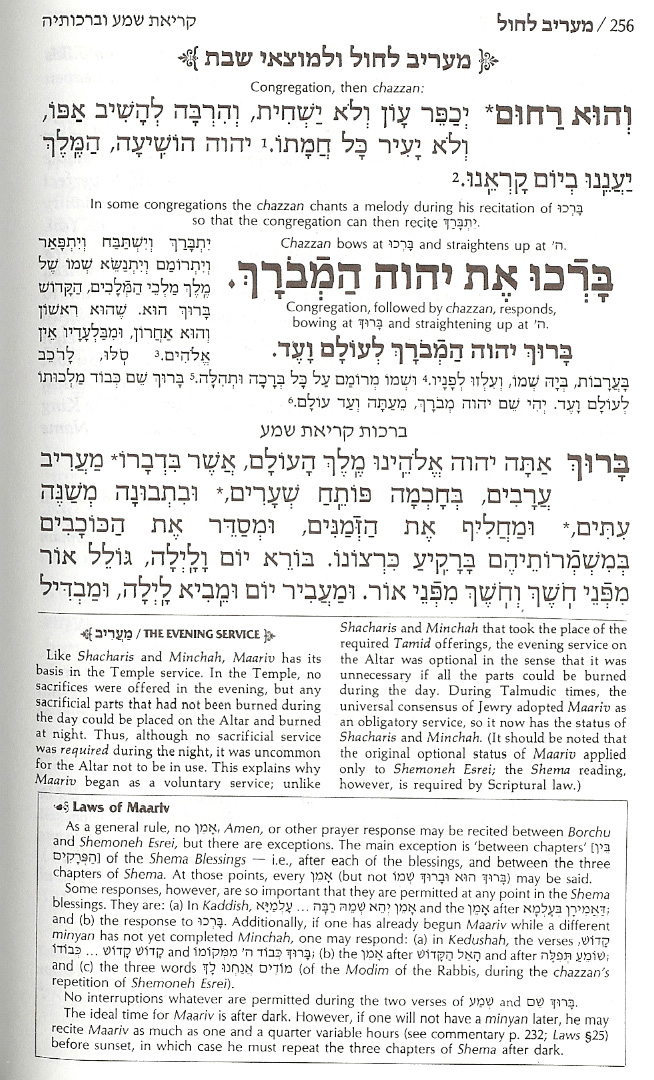
Back in the '80s, the weeks before Passover consisted of reading dozens of haggadahs, talking with friends, and gradually cutting and pasting a text that felt right as that year's haggadah. When I first started playing with Acrobat, there were still no standards for Hebrew, but I figured that I could go better than ASCII by encoding the Hebrew as it was then done, and putting it into a form where anyone could download, print, cut and paste.

But, of course, no one wants to do that any more. And no one should have to: we have lots of tools for editing Hebrew, and Unicode fonts. So, this year, a bit late, as usual, I have redone that minimal Haggadah Toolkit and input the Hebrew using Unicode so that it =should= be possible to cut and paste into whatever tool works for you. Of course, by now, everyone has finished the Haggadah and just needs to print them up for the seder Saturday night, but just in case, the new version is now available. And better, it will still be there next year, maybe with a bit more Hebrew, as I have time.

Passover Haggadah Toolkit, v 0.2

How to design Hebrew fonts

While I was checking out the Typophile forums yesterday, I found a short, but very useful threat about designing multilingual fonts using FontLab 4.6 (still the current version—runs on Mac or Windows) and, for some features critical to Hebrew OpenType layout, VOLT (Windows-only still?). Tale a look at Typophile forums of multilingual type design tools.

April 17, 2005

A new siddur; a new Haggadah

Art Scroll siddur detailFor years I have been under the illusion that many people using word processors and informal tools to create prayer materials "get it", but that official book publishers don't. In fact, it has been a common source of depression for me as I get into discussions with customers, many of whom know Hebrew Typography the way I know davenning (kindly put: complementary ignorance). Customers want their publications to look like the others on the shelf. I can't imagine why. It's a situation that isn't helped by the vogue for "ArtScroll" publications. (I put the name in quotes because ArtScroll:Fine Traditional Hebrew Typography :: Korn:My idea of good rock music, which is to say, it's the sort of loud thing that kids like, but tend to outgrow.)

[Those who have a clue about traditional siddurim know how unfair this is to the ArtScroll folks. What they have done is far more interesting, if still discouraging. After painstakingly putting together publications that help guide the davenner through the minutiae of prayer, they never researched typography. Instead, they designed cleaner, modern versions of the nightmarish siddurim with which we grew up. So, if you are willing to believe that those horrible Hebrew School siddurim were okay, just needed to be printed better (and then added the insight that people do need instructions, not just transliteration/translation), then you will really, really like the ArtScroll approach. I'm going to have to add an entry some other day in which I compare the two: as near as I can tell, we buried the last of our '50s siddurim a few moves ago.

Art Scroll siddur detailBut I didn't come here to complain about ArtScroll typography. That's an ongoing theme of my typographic life and doesn't need to be in each and every post. Instead, I want to kvell about a new Reconstructionist siddur, this one from Congregation Dorshei Emet, the Reconstructionist Synagogue of Montreal. It uses fonts that work together very well (primarily Zapf's Palatino for the English paired with Henri Friedlander's Hadassah for the Hebrew, with some Myriad or similar humanist sans serif for instructions and some translations).

papercut detail - click for largeThe design is very simple. It's also effective. Grace is provided by the papercuts that begin each section. I like the look of it, obviously. I'll have to daven with it before I know whether or not I can relate to the service, although I have generally felt at home with Reconstructionist services. (When it comes to type, I can be a dogmatic traditionalist in some ways; when it comes to prayer, suddenly I become a Reconstructionist, paraphrasing Mordechai Kaplan: "the past should have a voice, but not a veto"

While I was doing my pre-Passover Haggadah browsing, I found a copy of the Ma'ayan Haggadah put out by the Jewish Women's Project of the Manhattan JCC. (The JCC is also the co-sponsor for some very, very hip evenings with DJ So-Called at the Slipper Room, but that's a subject for the Klezmershack.) If you click on the detail, below, you'll see a nice page that gives a partial sense of the gracious use of space and graphic. I really like the effective use of type and color—note how they manage to present "hebrew | transliteration translation" in the running head, for instance. It is clear and graceful. As I close off this quick entry, I think of it as the opposite of the cacophony of, say, the ArtScroll approach which I presented at the top of this item.

haggadah detail - click for large

Anti-reader Hebrew-English typography - where did it come from?

Hertz spread
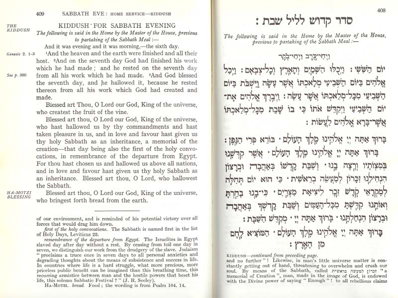
We all know what a typical, modern Hebrew-English siddur looks like. I covered this in an early >entry on siddurim. But, how did we get there? After all, there is no shortage of historical examples (a few are uploaded in my Polyglots Gallery) of how to mix Left-to-Right and Right-to-Left multilingual texts. I happen to be fond of pointing people to the Porro Polyglot, but there are many, many good examples of books made so that the Hebrew and English work together.

I have spoken with the few authorities on Hebrew typography that I know, over the last few months. As it happens, while I have no shortage of connections with people who know the physical type and its roots, and who know calligraphy and micrography, I have yet to locate someone who has done work on how we got to the familiar layout in use today.

Let's first consider some issues around multilingual typography. First, putting more than one language on a page is distracting. You don't do it without a reason. I have had many wonderful discussions with Maxim Zhukov, now retired, but for many years in charge of printing at the United Nations. He recalls that bilingual texts are not uncommon, but that the usual way of accomodating both languages (except when they need to be together for pedagogic reasons) is to have each language start from a different cover. With Hebrew or Arabic, coupled with a Latin-based language, this is simple. We start each language from the cover that is natural to it, and if there are shared photos or illustrations, they get put in the middle. If the two languages share the same reading direction, one is upside down to the other, generating the same effect. The languages are kept apart, confusion is minimal, and design is simple. It is also common, when mixing more than one similar language, to typeset them in bands, clearly differentiated, but with, say, the top of the page in French, the middle in German, and the bottom in English.

Porro detailSometimes, the languages have to appear together in a form makes them appear equal, or that facilitates translation. This is the case in the Polyglot bibles, like the Porro shown here. A few others are in my Polyglots Gallery. For UN purposes, this could come about because the UN has two official languages (French and English), or because of the need to present multilingual documents such that all appear to be equal.

But, in the case of the familiar Hebrew-English siddur that most of us know today, I am going to contend that the layout is an accident, somewhat related to my earlier comments on how one most easily presents two languages: by keeping each out of the other's face. I can easily visualize rabbis or pedagogues realizing that not all congregants would be facile in Hebrew, and trying to find ways to accomodate those who needed help in following along.

I visualize a need to placate those who wanted to keep the English out of the way, so as not to interfere with those who are comfortable without it. You can hear the discussions with traditionalists who ask that, if English must be included, it be put somewhere—on a facing page, for instance—such that it won't get in the way of speed-davenners who, after all, are the backbone of true faith :-). The Hebrew is placed on the recto (right hand) page, of course, because that is the first page when reading from the Hebrew side of the siddur. English goes on the verso (left-hand page).

Most pages are justified, that is, space between words is adjusted so that the right and left margins are straight. It seems to be a general human aesthetic that such margins look "better" to us. This longing for straight, neat margins also expresses itself when both Hebrew and English appear on the same page. We reinforce the idea that Hebrew belongs on the right-hand side of the page, at the greatest distance from the English (on the left-hand side of the page) because that, too, gives us straight margins. If our pages were graphics, and if we ignore the hole in the middle of the page (which most of us do), then this is an excellent solution.

"Dueling alphabets" is also an excellent solution if we are comfortable with the idea that people will look at either the Hebrew, or the English. And there are numerous examples where this is true: the program for an art exhibit, for instance, or a copy of a treaty where each side will read the treaty in a familiar language. Sometimes, this is also true when we combine Hebrew and English translation (as opposed, say, to transliteration, which absolutely must match, even line for line, to be most useful). If the translation isn't "word for word" (and usually it isn't), we may deliberately not want to facilitate the attempt at matching words back and forth because we know that it won't be helpful.

bencher sample w/dueling alphabetsMostly, though, dueling pages of Hebrew and English is an artifcat that doesn't work for the people for whom the bi-lingual edition was usually prepared: those who are not facile in Hebrew, who want the help of translation or transliteration to aid them in davenning. The result of this "traditional" (traditional only if we consider the last century, not the recorded history of multilingual bibles and siddurim) resembles the ballot in certain Florida counties during the 2000 election: once you know the logic, you can see how you ended up there, but there is no shortage of solutions to the problem that could be/have been offered by experienced typographers that address the issue without causing the awkward side effects (in the case of Hebrew/English, having the languages situated so they least help those for whom both were printed; in Florida, the election reached a different result that might have been counted had the majority vote been correctly recorded).

That's the situation as I currently understand it, based on about 20 years of multilingual typography. If there is irony, it lies in the fact that better layouts are relatively uncommon, and look funny to people. But we're making headway. I'm going to write about two new books next entry.

Comments?

Unicode-based Hebrew type transliterator

Judith Pinnolis, of the Jewish Music Web Center located a nifty website that she uses to help her type Hebrew: a transliteration tool that creates text that can then be pasted into a standard Hebrew word processor: www.amhaaretz.org/translit.

I found that I cannot paste the text created by this page directly into Dagesh Pro, nor can I paste directly into my HTML editing software (I was hoping to see the Unicode-composed text for HTML purposes), but I =can= paste directly into the ME version of InDesign, and also directly into AbiWord or Hebrew-enabled MS Word. This fact, and the overall design of the transliteration page, lead me to believe that Unicode is being generated. If so, then hebrew text editors will gradually catch up.

In the meantime, the ???? ???? that one sees in some editors (after pasting in the text generated by the transliterator) is an artifact of the fact that Hebrew used to be encoded differently, and is a reminder that the conversion to Unicode, like the move (for Hebrew purposes) to OpenType fonts is eliminating a lot of the twitchy geekiness that has accompanied using Hebrew on computers in the past. And, in the short term, this means that if you are using an editor that doesn't understand Unicode, this tool isn't yet helpful.

Anyway, there is more explanation on the Am Ha-aretz pages, and a great link to David McCreedy's Gallery of Unicode Fonts - Hebrew, so a double bonus of good stuff from Am Ha-aretz' Ami Hertz.

Discussion of new Hebrew Typeface

Mike Thompson writes in to let me know that there is discussion of a new, and rather interesting Hebrew typeface on which he is working at the Typophile board. Although I'm not seeing deep discussion, the comments so far are useful to anyone considering a similar project, and I like the core design. Take a look at www.typophile.com.

In the meantime you can read more about the font, itself, and download it from Mike's own website, mikethompsonpaintings.com/font.

Dr. Berlin retires

I seem to have been too busy setting Hebrew to keep up this blog in recent months. Among the transitions I need to note, I have had to remove the link to Dr. Berlin's amazing font archive. As Roger Reid let me know back in January, he has retired. According to a posting on LiveJournal, the font archive was closed on 1/31/05 after nine years of service. The good Dr. does have a personal website at www.drberlin.com, but he has not continued his font activities there.