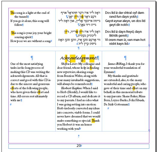
 I was typesetting a new Yiddish CD. The song lines were relatively short, so I decided to set English, Yiddish, and transliteration all parallel. My idea was that even if every line turned over, I would still be slightly ahead of what happens when I set, say, Yiddish+translation, plus the same number of lines underneath, padded by a bit of space, for the translation. A bit dense (and not something I'm likely to repeat), but overall, it worked well. I also thought I'd see how I felt about putting the English on the left of the Hebrew. I do see how I feel—I don't like it, even in a layout this dense.
And, as you'll see, I managed to get into big layout trouble, despite InDesign generally making this sort of work easier than any other tool I've ever used. (Yes, in part this means that tools for doing multi-lingual typography has generally sucked big-time.)