YAIHT: Yet Another Introduction to Hebrew Typography
My first stop was to read a copy of yet another "Introduction to Hebrew Typography," this one by Ellic Howe, in Signature 5, 1937. Here I found a kindred soul, who focused less on what books were printed where, but rather on the type, itself, and its context. Howe summarized the situation in Italy, where the earliest Hebrew printing is said to have taken place only a few years after Guttenberg's first efforts and continued sporadically before taking firm root in the 16th century.
What I didn't know (or what hadn't stuck in my head previously) was that Israel Soncino, the first of the Soncino clan, was in business in Soncino, Italy, as a banker. Israel's father, Samuel, had originated from Speyer, in Alsace. The founding of a municipal public loan office put Israel out of business, so he turned to printing with his sons and grandsons. It was the grandson, Gerson, of whom we usually think when we think of the Soncinos. Howe describes him as the greatest of Hebrew printers. Gerson was kept on the run by persecution although, as I noted a few days ago, he also hired Francesco Griffo to cut some of his first punches when Griffo quarreled with Aldus Manutius over not being given credit for creating Aldus' type. In 1497 Soncino went to France. According to Howe, at the time, he was the only Jewish printer in existence. Eventually Gerson took refuge in Turkey, under the Ottomans, where he died broke and bitter. And well he should have felt bitter given what he had been through.
In the discussion of France, Howe mentions the great punchcutter Le Bé I. Most notable is a sample of a display of Hebrew script, cut by Le Bé in 1591, which is based on a cursive form that is very similar to the face we now know as Rashi (and which was used to set the Rashi commentaries in the first printing of the Talmud). My detailed knowledge of Hebrew lettering is sufficiently lacking that it came as a thrill to see this same script existing in France 100 years after it inspired type in Italy.
Of Germany, Howe writes: "There were more typefounders at work in Germany in the Seventeenth century than in any other country, and the great majority of them possessed Hebrew types, which rivalled their roman founts for ugliness." Alas, my limited personal research is in solid agreement.
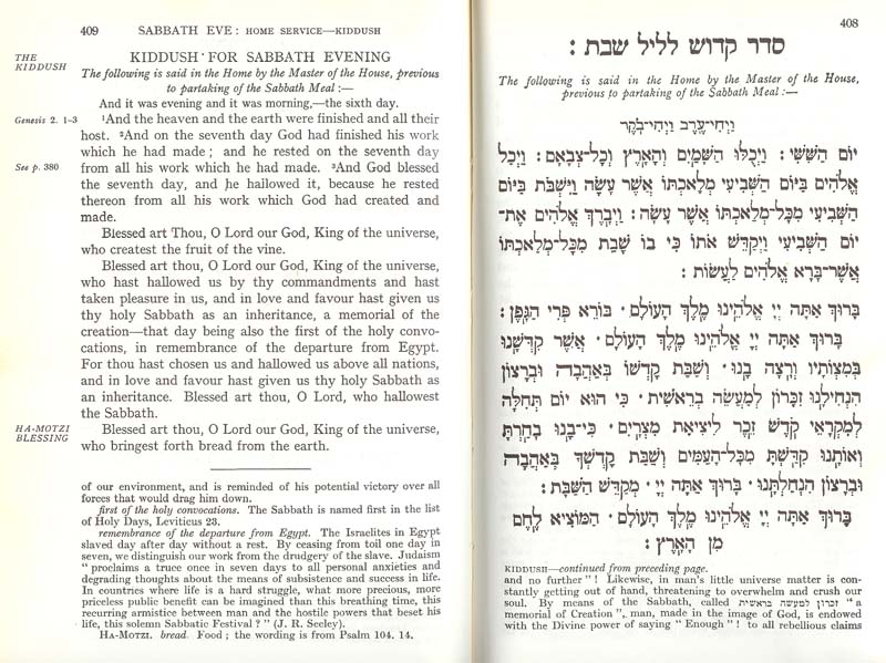 Although I had known that Holland was a center of Hebrew printing, I hadn't yet put two and two together and realized that this was caused by the centuries during which it was the first refuge of crypto-Jews fleeing Spain and Portugal, a process that began in 1492 (? or earlier? later?) and continued until the eighteenth century. Those familiar with the Hebrew types of Plantin (actually, usually the types of Le Bé) or of Nicholas Kis (the true cutter of many faces once attributed to Janson) will not be surprised. Indeed, I have at hand a Hertz Standard Siddur which uses type clearly based on Le Bé's.
Howe sums up the efforts of these 16th&ndash18th century printers thus (after first noting that most punchcutters were not Jewish, and had no deep knowledge of Hebrew letterforms):
The Englishman, the Frenchman, and the Dutchman, at any time between 1600 and 1800, would cut a Hebrew punch in accordance with a national tradition rather than a specifically Jewish tradition. At the end of the eighteenth century, when punchcutters generally were obsessed by the virtuosity of cutting hairlines and beautifully right-angled serifs, they one and all, applied the technique of cutting modern face roman types to their Hebrew founts. The results were disastrous, and Hebrew type design has yet to recover from the effects. (p. 27)
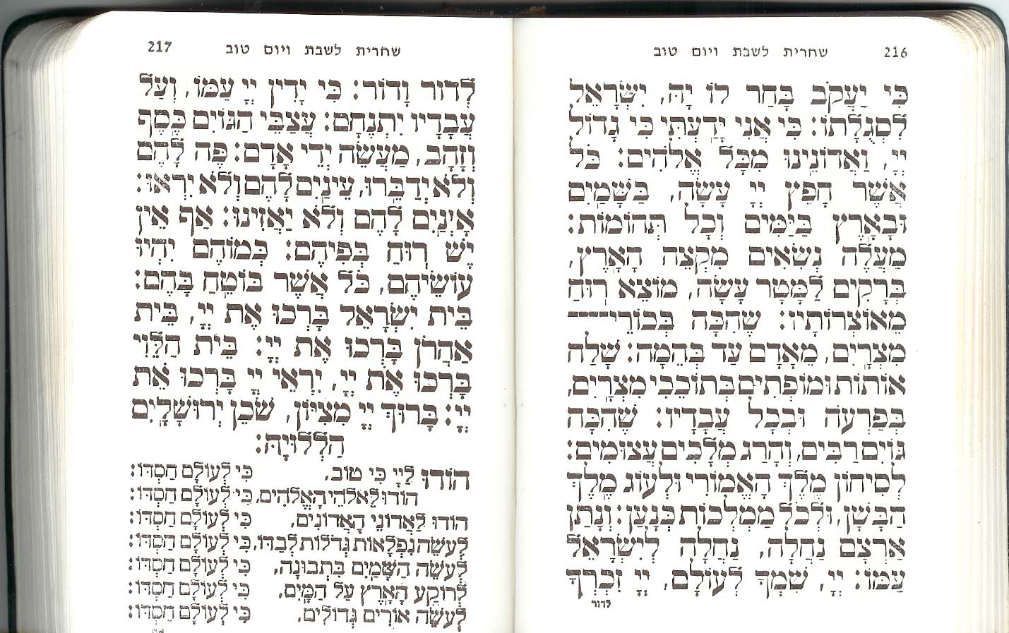
Indeed, you can see from the spread referenced here that this awful contrasty, Bodoni-influenced type still exists. This is from a pocket siddur published in Israel in recent years. We may have a plethora of modern types, but bad type habits persist, like eczema.
 Howe let me down only in the end, where he references a now impossible-to-find book by Hugh Schonfield (in 1937, but recently published, "The New Hebrew Typography." Howe agrees with Schonfield that the old letters should be abandoned and a new Latin-like lettering used. Bah. Humbug.
Bibliographies and books in other languages
 I had a happy time wandering up and down through the Brandeis stacks looking up books by Moshe Rosenfeld, who did some excellent bibliographic references. This material is incredibly valuable for scholars looking to see how printing presses diffused, and the types of materials that were being printed. Rosenfeld's הדפוס
העברי
מראשיתו עד
שנת תש"ח (The Hebrew Press from its beginning through 5708) contains hundreds of poor xeroxes of title pages, in addition to the bibliographic data. From the introduction to that book, I was led to an early Max Weinreich book, "The little black marks" (די
שוורצע
פינטלעך), which discusses the evolution of the alphabet (including Hebrew) and included this wonderful comparison of Ashkenazic Hebrew typeforms and German Fraktur (click on the thumbnail to see the Fraktur type on top of the chart). I am not the first to notice this similarity. It is, for Hebrew—in my never humble opinion—yet another horrid dead end (see Ellic Howe's comments on the influences of Bodoni-influenced, "Modern" types on Hebrew, above). There is no doubt in my mind that some Latin type ideas have positively influenced modern Hebrew type. But, the best modern Hebrew types, like the best traditional ones, are rooted in Hebrew calligraphy, not Latin in typography.
I had a happy time wandering up and down through the Brandeis stacks looking up books by Moshe Rosenfeld, who did some excellent bibliographic references. This material is incredibly valuable for scholars looking to see how printing presses diffused, and the types of materials that were being printed. Rosenfeld's הדפוס
העברי
מראשיתו עד
שנת תש"ח (The Hebrew Press from its beginning through 5708) contains hundreds of poor xeroxes of title pages, in addition to the bibliographic data. From the introduction to that book, I was led to an early Max Weinreich book, "The little black marks" (די
שוורצע
פינטלעך), which discusses the evolution of the alphabet (including Hebrew) and included this wonderful comparison of Ashkenazic Hebrew typeforms and German Fraktur (click on the thumbnail to see the Fraktur type on top of the chart). I am not the first to notice this similarity. It is, for Hebrew—in my never humble opinion—yet another horrid dead end (see Ellic Howe's comments on the influences of Bodoni-influenced, "Modern" types on Hebrew, above). There is no doubt in my mind that some Latin type ideas have positively influenced modern Hebrew type. But, the best modern Hebrew types, like the best traditional ones, are rooted in Hebrew calligraphy, not Latin in typography.
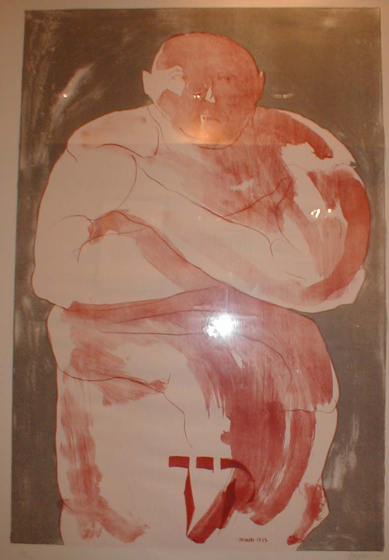 As I wandered up and down five floors of Brandeis stacks, I stopped and enjoyed a wonderful exhibit of the work of Leonard Baskin, primarily known as a sculptor, but also the person behind Western Massachusetts' "Gehenna Press". Baskin's woodcuts are a treat, and it was quite refreshing to spend a few minutes gazing at them and enjoying. Brandeis has put much of the exhibit (but not the picture here) online, at library.brandeis.edu/specialcollections/specialevents/baskin. It is good to be working in a library that doesn't hesitate to remind you that there are wonders beyond one's immediate fixation.
Canaanite to Aramaic: Early letterform politics
Okay, years ago, when Lili Wronker gave me my first lessons in Hebrew Typography, I spent some time with Soloman Birnbaum's "The Hebrew Scripts." One of the impressions that I left with was the extraordinary story of the transition between the original Canaanite letterforms used in pre-Babylonian-exile written Hebrew, and the later Aramaic style of "square letters" that we use now. Modern writers about Hebrew letters (e.g., Ada Yardeni, in The Book of Hebrew Script) note that just as Aramaic became the lingua franca, so too did the Aramaic letterforms. Yardeni also notes that the last examples of the earlier letterforms were found at Massada. Sounds like a simple case of cultural imperialism, much as English has replaced French as the language of diplomacy in much of the world. This visit was to refresh my memory and to take a look, again, at the details of the story, which I remembered as much more surprising.
Indeed, according to Birnbaum, by the time of the return from the Babylonian exile (fifth century BCE?) most secular writing was done using the new square letterforms. But he found it curious that there was a change in the letterforms used for sacred books. Religions, after all, tend to be quite conservative. In some regards, changing the letterforms was as radical an idea as translating the TaNaKh from ancient Hebrew into the then-modern Aramaic. It was also a change that happened relatively quickly. Birnbaum wondered if there were more to the story.
First, he pinpointed the time of the change. The Talmud offers several references to the change. Rabbi Eliezer ben Jacob (2nd half of the 1st century, CE):
Three prophets came with them from the Exile ... One testified that the Torah [scrolls] must be written [in square script].
And R. Yose says:
Ezra was worthy of the Torah being given through him to Israel but Moses [happened to] precede him.... Although the Torah was not given through him, [its] script was changed through him.
So, what gives? Later Christian sources offer independent versions of the story. For instance, Birnbaum cites Epiphanus (ca. 315-403 CE):
The Samaritans, however, retain the deese non, which form, as we have said, was engraved in older times in the stone tablets. But when Ezra came up from Babylon and desired to make Israel different from other peoples in order that the offspring of Abraham should not appear to be defiled by the inhabitants of the land—who have, indeed, the Law but not the Prophets—he changed the previous form, abandoning the deesenon, because that form was already in the possession of the Samaritans, in order that the seed of Abraham should thereby be distinguished from the rest of the nations.
Whew. So, just as Ezra demanded that all Jews from the Holy Land divorce their Samaritan spouses, he also protected the Holy texts by declaring all Holy texts written in the old script "unkosher". It ensured that only Holy texts from Babylonia, or that were written by scribes returning with him from exile, were used and prevented adding post-exilic Samaritan writings to the TaNaKh. Samaritans still use the ancient script.
Interestingly, neither the popularity of Aramaic letterforms for general Hebrew, nor the exclusive use of Aramaic letterforms for Holy texts, meant that the earlier letterforms disappeared immediately. During the Persian period, local Jewish Palestinian authorities used the Canaanite forms for official documents, presumably as a sort of "nationalist" differentiation from the rest of the empire. Coins were also struck locally using the old script.
And then, hundreds of years later, under the Macabbees, that same lettering was used for coinage. According to Birnbaum, this was not because the letterforms were representative of some inner clique that had preserved the Canaanite lettering—that makes no sense given the religious prohibition against using the letters for Holy texts. Indeed, even Bar Kochba's writing (he the leader of the last rebellion against the Romans, the war in which the zealots at Massada committed suicide rather than be captured) is in the square letters. Rather, he suggests, they did it because that was the tradition: they probably made coins just like the coins used last time Jews had been sovereign in Israel. Those coins are the "last known uses of the Canaanite letters for Hebrew writing", and are hundreds of years after such letters were used for anything but coins. And, indeed, modern Israeli coins continue the tradition, so Canaanite letterforms have been reborn. Not.
When I am next solvent, I must find a copy of Birnbaum. There is too much detail here not available in any other general text.
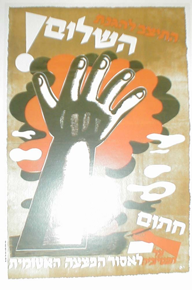
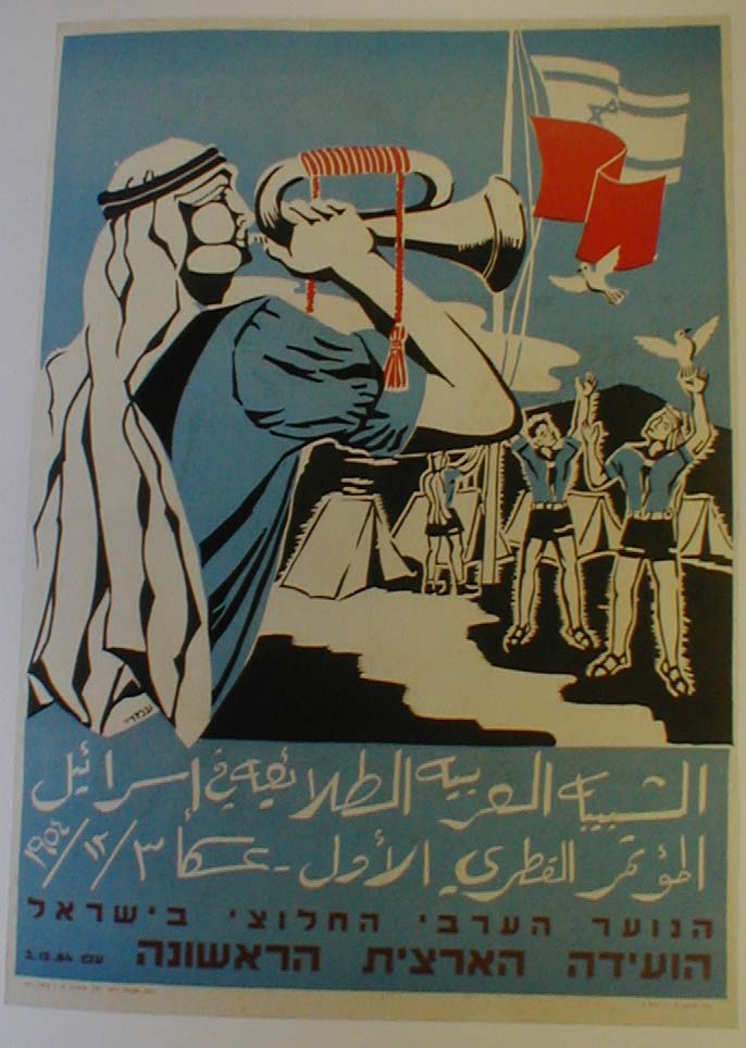
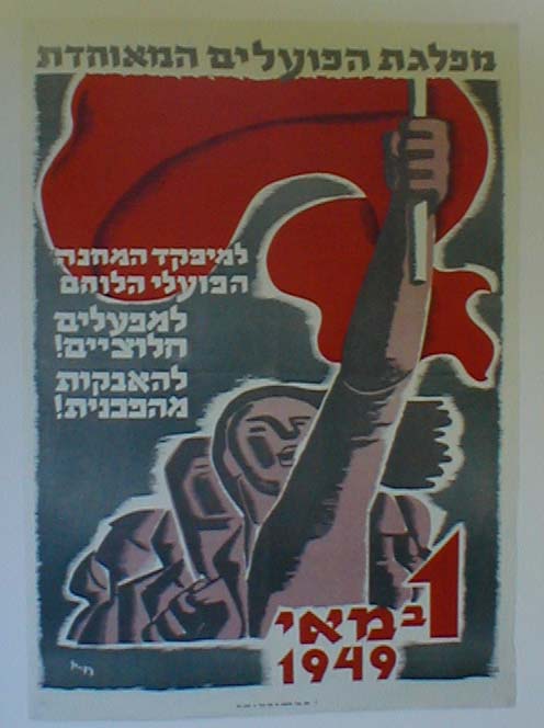
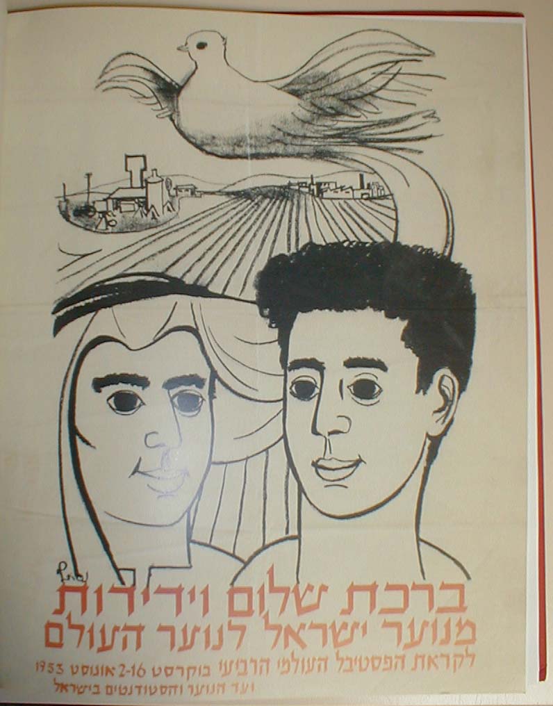
Type in the Service of Politics
And I ended the day looking at some early Israeli posters, this from a book about political art created for Hashomer Hatzair and Mapam in the '50s, אמנות בשרות רעיון ("Art in the service of an idea"), edited by Shlomo Shaaltiel in 1999. Note the homage to the calligraphic slanted end-stroke on many of these letterforms, which typify modern Hebrew of the 1950s. (Today, these are still common themes, but there is also a lot more imitation of Latin display types.)