In further preparation for the project mentioned a few minutes ago, I took a look at several prayerbooks and offered them to the client so that we could consense on the look and feel that would meet his need. It then occurred to me that it is worth posting the same scans here, with some accompanying discussion.
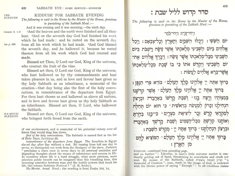 I started with an old friend–the siddur I received at my Bar Mitzvah. This is a page from the venerable Hertz siddur, by Joseph H. Hertz, late Chief Rabbi of the British Empire. How that made its way to Dallas, Texas, I do not know, but it is a wonderful siddur and survives 30 years of occasionally careless use. Many people enjoy it as much for the commentaries and notes as for the service, which is set in a warm setting of a 19th century Hebrew (Vilna?). Not a font I would be likely to use today, but one that does stand up reasonably well to time.
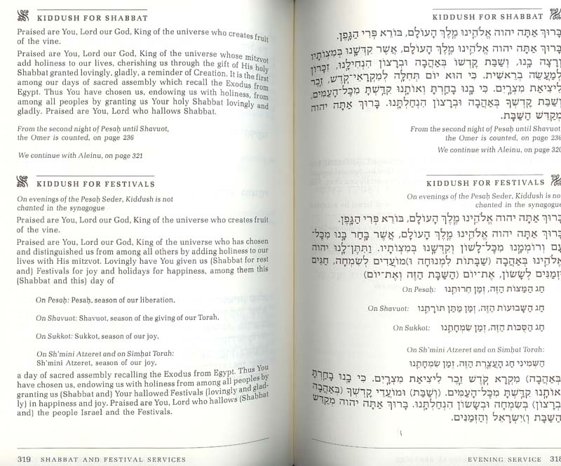 Next, take a look at this spread from the "Sim Shalom" siddur. It seems to be popular in the American "Conservative" movement. I find it is reasonably well-produced, and while Friedländer's Hadassah is set a bit loose for my taste, it does go reasonably well with the blocky Zapf Book, also set a bit loose for my taste. Note the excellent use of space, the even color of the pages, the small dingbats, rules, and careful use of small caps that help separate sections. This might be thought of as the "anti-Art Scroll" siddur: tasteful, readable, pleasant, clear, quiet. (Those who have seen ArtScroll productions may have recoiled from the vulgarity and cacaphony of the pages with their plethora of sizes and weights–proof that it Hadassah need not always be a delight to read.)
As was the case with the Hertz siddur, the English is on the verso (left) page, and the Hebrew is on the right. This is opposite how the great polyglot calligraphers and typographers of the preceding few hundred years would have set things up, but it has become standard over the last 100 years. It would not be a bad idea to rethink, although I also confess that I find myself bending to the will of clients frequently, and perpetuating the problem. The thing is, if you are publishing for people who need/desire both English and Hebrew, you want to make it easy on the eye. In this layout, the eye starts at one far edge of the spread, and if looking to see the translation, must jump over the entire width of the spread without losing its place. But, our eyes don't work that way, so most people using this sort of book become subconsciously used to the fact that navigating back and forth requires considerable effort. See the next sample for a better way to arrange things.
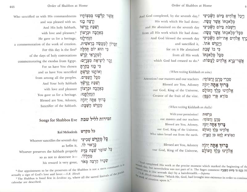
 The third sample, which is also shown here in miniature, is from the recent (1996) Reconstructionist siddur, "" (Voice of the Soul). The Hebrew is our old friend, Frank-Rühl, which I think of as the "Times Roman" or "Helvetica" of Hebrew - ubiquitous to the point where I try to avoid it. The text is nice and Bembo-ish, if not always sized perfectly. Actually, I find the layout often crowded and clunky, but the really neat thing is that, while this follows the "Hebrew on one page; English on the other" style that is popular in American bi-lingual siddurim, here the Hebrew is properly on the verso (left). In fact, for all that I have complaints about the actual execution of the book, whoever designed this had a nice sense of Hebrew typographic principles. There was also some care taken with the actual font design. Note the word "kol" and the kamatz-katan (or is that kamatz-gadol–it's late at night and suddenly all professional terms have been vanishing).
 Finally, on a whim I included the "Metsudah" siddur that my wife enjoys. Again, the type is undistinguished, and the Hebrew has traces of the ArtScroll cacaphony with slightly outsized initial words on many sections. But take a look at how the Hebrew and English are organized: They got it half right. The lines are short (deliberately, as I found out from reading the book's introduction), so that the Hebrew and English are on the same line. The breaks are correct, so that the English is the translation of the current line of Hebrew. Here is how the introduction describes it:
The aim of this Siddur is twofold--to afford the suppliant an opportunity to learn and understand the meaning of the words of prayer, and at the same time encourage him to adopt a slower more realistic pace of davening which will also permit him to pronounce each word properly.
We have thus limited each line of prayer to three or four words, each line containing a complete tefila thought. In the new linear design, each translation is on the same line as the Hebrew text, providing the suppliant instant explanation of the words as they are recited....
So, having had such amazing kavana (intent), how badly did they mess up? Well, pretty awfully bad, if you think about it. The Hebrew and English are backwards from where they should be. By putting the English on the left and the Hebrew on the right the designer repeats the common recent mistake. Worse, this means that in whatever language you are reading, your eye always has to hunt for the beginning of the line. This is not my idea of facilitating thought and meditation. It is my idea of a headache. You'll also notice that the Hebrew lines are simply too tight–there isn't enough vertical space between the lines (leading, or line spacing). Phooey. Amateurs. Feh. A bad siddur for davenning.
So, what will my design reflect in this new siddur? I'll have samples when it is all over, but in my mind's eye, I'm going to do something similar to the "Metsudah," but with the Hebrew and English in the correct position relative to each other, and I'll probably use Narkissim or Narkiss Classic for the text, eschewing both the over-worked Frank Rühl and the common, but always welcome in a good rendition, Hadassah.

The criticism of Artscroll is that it is set entirely in one font... whereas the tradition european siddurim changed designs to give emphasis to the more important parts of the liturgy. Thus, the traditional siddur was easier to navigate. I consider the metsudah siddur to be impossible to navigate for this reason. Artscroll had a very practical reason, they had commissioned a typeface design from Compugraphic (I think), and it was the first and only complete typeface of its generation of photo-typesetting machines. This enabled them to produce texts with hebrew and English in the same line, allowed them to insert screens (the shaded background to paragraphs like Al-Hanissim), but was too costly to allow them to produce more than one full typeface with nekudot and one or two decorative typefaces for invitations (the original function of the Artscroll Studio).
At least here, the complaint is certainly not that Artscroll books are set entirely in one font—that isn't what I wrote, and is certainly not what I intended. Rather, Artscroll publications use a cacophony of sizes and weights. The fact that they are all in a poor cut of Hadassah doesn't change the jumbled effect of Artscroll books, or the general lack of typographic standards in production.
I would go a step further—it is relatively rare that one needs more than one type family for a book. Sometimes it is nice to use something different for heads, or to help differentiate some types of elements, but this is hardly necessary.
In summary: the complaint is that Artscroll books use too many sizes and weights of font, creating visual chaos. The further complaint is that the actual typography is not executed well, even in purpose of a design that I already find problematic.
In the Artscroll Prayer Book, there is an error in the prayer for the New Moon. Hayyim Arukhim should be Hayyim AruKim. The first is grammatically incorrect.
Dr.Herman Zeffertt
Birmingham, U.K.