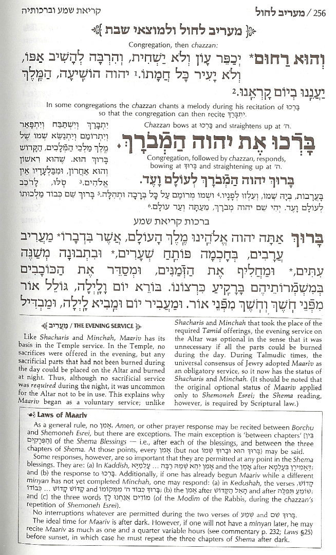
 For years I have been under the illusion that many people using word processors and informal tools to create prayer materials "get it", but that official book publishers don't. In fact, it has been a common source of depression for me as I get into discussions with customers, many of whom know Hebrew Typography the way I know davenning (kindly put: complementary ignorance). Customers want their publications to look like the others on the shelf. I can't imagine why. It's a situation that isn't helped by the vogue for "ArtScroll" publications. (I put the name in quotes because ArtScroll:Fine Traditional Hebrew Typography :: Korn:My idea of good rock music, which is to say, it's the sort of loud thing that kids like, but tend to outgrow.)
[Those who have a clue about traditional siddurim know how unfair this is to the ArtScroll folks. What they have done is far more interesting, if still discouraging. After painstakingly putting together publications that help guide the davenner through the minutiae of prayer, they never researched typography. Instead, they designed cleaner, modern versions of the nightmarish siddurim with which we grew up. So, if you are willing to believe that those horrible Hebrew School siddurim were okay, just needed to be printed better (and then added the insight that people do need instructions, not just transliteration/translation), then you will really, really like the ArtScroll approach. I'm going to have to add an entry some other day in which I compare the two: as near as I can tell, we buried the last of our '50s siddurim a few moves ago.
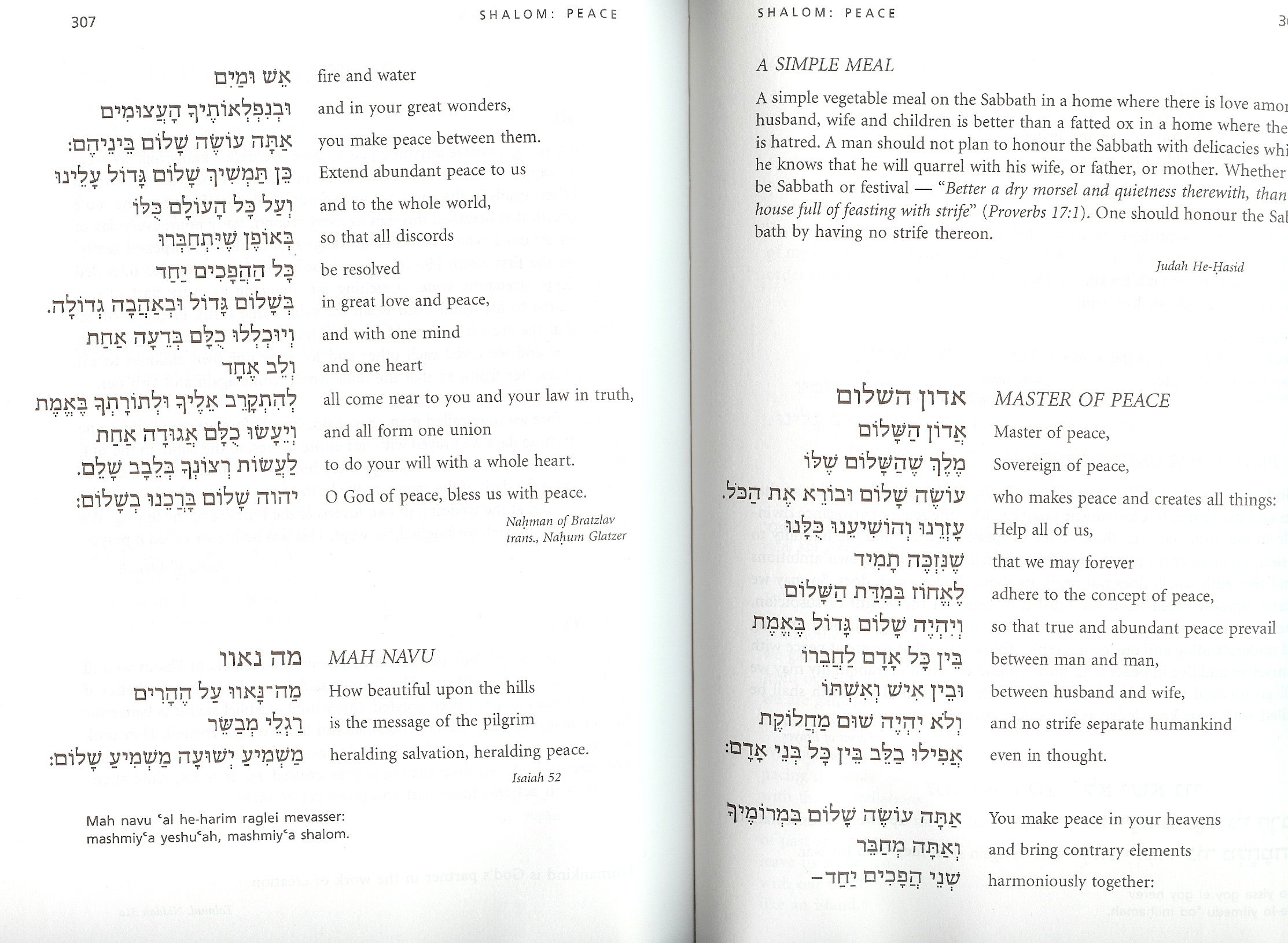 But I didn't come here to complain about ArtScroll typography. That's an ongoing theme of my typographic life and doesn't need to be in each and every post. Instead, I want to kvell about a new Reconstructionist siddur, this one from Congregation Dorshei Emet, the Reconstructionist Synagogue of Montreal. It uses fonts that work together very well (primarily Zapf's Palatino for the English paired with Henri Friedlander's Hadassah for the Hebrew, with some Myriad or similar humanist sans serif for instructions and some translations).
 The design is very simple. It's also effective. Grace is provided by the papercuts that begin each section. I like the look of it, obviously. I'll have to daven with it before I know whether or not I can relate to the service, although I have generally felt at home with Reconstructionist services. (When it comes to type, I can be a dogmatic traditionalist in some ways; when it comes to prayer, suddenly I become a Reconstructionist, paraphrasing Mordechai Kaplan: "the past should have a voice, but not a veto"
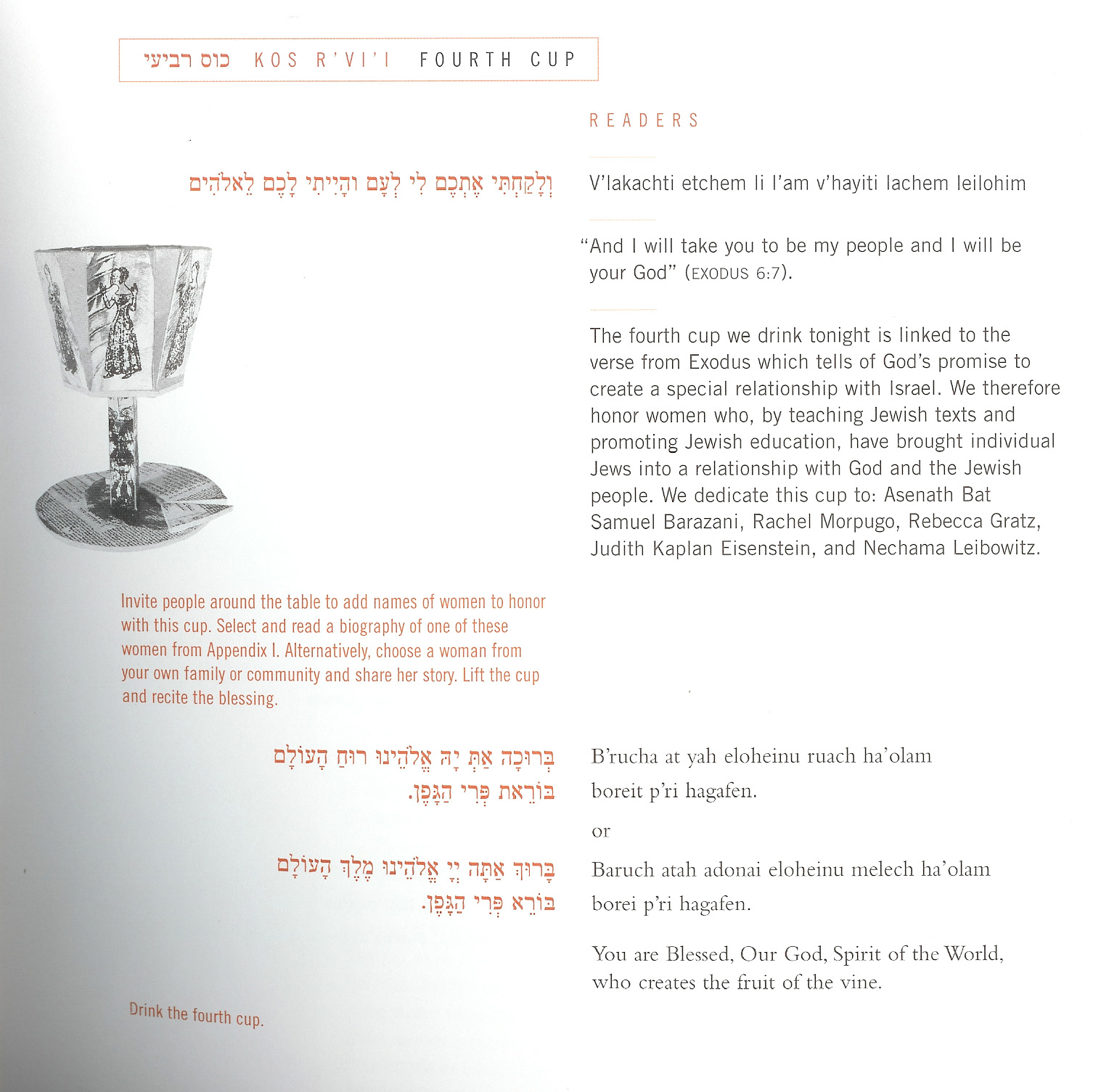
While I was doing my pre-Passover Haggadah browsing, I found a copy of the Ma'ayan Haggadah put out by the Jewish Women's Project of the Manhattan JCC. (The JCC is also the co-sponsor for some very, very hip evenings with DJ So-Called at the Slipper Room, but that's a subject for the Klezmershack.) If you click on the detail, below, you'll see a nice page that gives a partial sense of the gracious use of space and graphic. I really like the effective use of type and color—note how they manage to present "hebrew | transliteration translation" in the running head, for instance. It is clear and graceful. As I close off this quick entry, I think of it as the opposite of the cacophony of, say, the ArtScroll approach which I presented at the top of this item.
I should mention that the Dorshei Emet siddur seems most easily attainable directly from the congregation: http://www.dorshei-emet.org/
Thanks so much for this idea of restructuring Hebrew/English texts. It makes so much sense to me as a designer.
I think I prefer the juxtaposition of the English translation next to the Hebrew, rather the transliteration, but it does depend on the quantity of Hebrew, whether it is blessing/prayer or text, the uses of the texts, etc.
In any case, an excellent idea.
I am looking to publish a new siddur and need the Hebrew set up - this is for daily (not Shabbat nor Festival) use only - according to the Orthodox tradition. If you have this digitally done, perhaps with an English translation, this would be great. Please advise.
I am overcommitted and will probably not look at new projects for several months, but Raphael Freeman, of Jerusalem Type, is quite excellent. See the sidebar to this blog, at the bottom, for his contact info.
In general, I am currently focusing on those projects where my design skills and perspective about better multilingual presentation make a difference.