 We all know what a typical, modern Hebrew-English siddur looks like. I covered this in an early >entry on siddurim. But, how did we get there? After all, there is no shortage of historical examples (a few are uploaded in my Polyglots Gallery) of how to mix Left-to-Right and Right-to-Left multilingual texts. I happen to be fond of pointing people to the Porro Polyglot, but there are many, many good examples of books made so that the Hebrew and English work together.
I have spoken with the few authorities on Hebrew typography that I know, over the last few months. As it happens, while I have no shortage of connections with people who know the physical type and its roots, and who know calligraphy and micrography, I have yet to locate someone who has done work on how we got to the familiar layout in use today.
Let's first consider some issues around multilingual typography. First, putting more than one language on a page is distracting. You don't do it without a reason. I have had many wonderful discussions with Maxim Zhukov, now retired, but for many years in charge of printing at the United Nations. He recalls that bilingual texts are not uncommon, but that the usual way of accomodating both languages (except when they need to be together for pedagogic reasons) is to have each language start from a different cover. With Hebrew or Arabic, coupled with a Latin-based language, this is simple. We start each language from the cover that is natural to it, and if there are shared photos or illustrations, they get put in the middle. If the two languages share the same reading direction, one is upside down to the other, generating the same effect. The languages are kept apart, confusion is minimal, and design is simple. It is also common, when mixing more than one similar language, to typeset them in bands, clearly differentiated, but with, say, the top of the page in French, the middle in German, and the bottom in English.
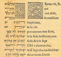 Sometimes, the languages have to appear together in a form makes them appear equal, or that facilitates translation. This is the case in the Polyglot bibles, like the Porro shown here. A few others are in my Polyglots Gallery. For UN purposes, this could come about because the UN has two official languages (French and English), or because of the need to present multilingual documents such that all appear to be equal.
But, in the case of the familiar Hebrew-English siddur that most of us know today, I am going to contend that the layout is an accident, somewhat related to my earlier comments on how one most easily presents two languages: by keeping each out of the other's face. I can easily visualize rabbis or pedagogues realizing that not all congregants would be facile in Hebrew, and trying to find ways to accomodate those who needed help in following along.
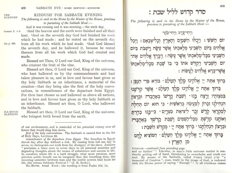
I visualize a need to placate those who wanted to keep the English out of the way, so as not to interfere with those who are comfortable without it. You can hear the discussions with traditionalists who ask that, if English must be included, it be put somewhere—on a facing page, for instance—such that it won't get in the way of speed-davenners who, after all, are the backbone of true faith :-). The Hebrew is placed on the recto (right hand) page, of course, because that is the first page when reading from the Hebrew side of the siddur. English goes on the verso (left-hand page).
Most pages are justified, that is, space between words is adjusted so that the right and left margins are straight. It seems to be a general human aesthetic that such margins look "better" to us. This longing for straight, neat margins also expresses itself when both Hebrew and English appear on the same page. We reinforce the idea that Hebrew belongs on the right-hand side of the page, at the greatest distance from the English (on the left-hand side of the page) because that, too, gives us straight margins. If our pages were graphics, and if we ignore the hole in the middle of the page (which most of us do), then this is an excellent solution.
"Dueling alphabets" is also an excellent solution if we are comfortable with the idea that people will look at either the Hebrew, or the English. And there are numerous examples where this is true: the program for an art exhibit, for instance, or a copy of a treaty where each side will read the treaty in a familiar language. Sometimes, this is also true when we combine Hebrew and English translation (as opposed, say, to transliteration, which absolutely must match, even line for line, to be most useful). If the translation isn't "word for word" (and usually it isn't), we may deliberately not want to facilitate the attempt at matching words back and forth because we know that it won't be helpful.
 Mostly, though, dueling pages of Hebrew and English is an artifcat that doesn't work for the people for whom the bi-lingual edition was usually prepared: those who are not facile in Hebrew, who want the help of translation or transliteration to aid them in davenning. The result of this "traditional" (traditional only if we consider the last century, not the recorded history of multilingual bibles and siddurim) resembles the ballot in certain Florida counties during the 2000 election: once you know the logic, you can see how you ended up there, but there is no shortage of solutions to the problem that could be/have been offered by experienced typographers that address the issue without causing the awkward side effects (in the case of Hebrew/English, having the languages situated so they least help those for whom both were printed; in Florida, the election reached a different result that might have been counted had the majority vote been correctly recorded).
That's the situation as I currently understand it, based on about 20 years of multilingual typography. If there is irony, it lies in the fact that better layouts are relatively uncommon, and look funny to people. But we're making headway. I'm going to write about two new books next entry.
Comments?

For what it's worth, if I had to guess, I would assume that the "traditional" typography originated with letterpresses that had Hebrew plates set, and that only later came around to printing a translation, so they did so with only a minimal amount of breaking the Hebrew originals.
That was one of the possibilities I considered, but the evidence seems to be against it - there are very rare occasions (the Jerusalem Bible, set with a later technology, comes to mind) where there is an existing Hebrew edition to which English has been added. In the days of cold type, this turns out to be especially unlikely since one page's type would have to be recycled to print the next spread. Those spreads would not be sitting around in a warehouse for reprinting or repurposing.
In the same way that there were (are) those who wanted (want) to keep the English out of the way, so too, there are those who wanted to keep the Hebrew out of the way. -- This leads to same situation.