Song Sheets and CD Notes
Tips for mixing Hebrew/Yiddish with English and/or Transliteration
Scribes hundreds of years ago first considered the problem of mixing different languages and alphabets. Early printers followed their lead. Sometime in the chaos of the last couple of centuries, much of that knowledge has been ditched in favor of new traditions that work poorly. This page is an expansion of a few paragraphs I originally posted to the KlezmerShack years ago. To keep this brief, I shall focus on good typography and leave bad to the imagination.
Basic Typography | Hebrew/English | Songsheets
![[TOP]](/images/top.gif)
Basic Typography
Column Width: If you purchase a well-produced book, you will notice that its size and thickness (often paperback, 6"x9", or similar dimensions) fits the hand easily. If you were to sit down and count the characters in each line, you would notice that, on average, there are 60 to 70 characters. Never more. Sometimes less.
There is a reason for this. At text sizes, the human eye catches about 20 characters at a time, and you can unconsciously move your head about three times before the eye starts to find it hard to remember what line was being read. Three clumps of about 20 characters gives you 60. If the lines are too long, or too close together, you start missing material. You may not notice, but if I were to test you on what you just read, we would discover that you had actually missed significantly more of the material and weren't even aware that it was there.
When working with a page sizes that makes it easy to exceed those character/line counts, the trick is to use two or more text columns. Most of us work with standard sheet sizes that are letter-sized (US) or A4 (UK). Using standard margins (1") and standard type sizes (12 pt) you will not produce comfortably-readable text. Breaking the page into two columns (or turning the paper sideways and turning each sheet into two pages) makes complex layout easier, and improves readability nicely. The same problem is encounterd with CD pages, and the solution is the same.
If you cannot use two text columns, create a stub column in which you put your headlines, some graphics, and notes. Then you are left with a narrower main text column. Another alternative is to use larger type and more space between lines. You will discover, by the way, that no word processor defaults to a reasonable line spacing value. Instead of allowing spacing to be "single spacing" or "double spacing", specify exact amounts. At a minimum, you will generally want to add two points to the type size (e.g., if using 14 pt type, specify exactly 16 pts leading or linespacing) or more—definitely more as your column gets wider.
Typeface: I have found that, in general, sans serif faces such as Arial, are much easier to read in low resolution situations such as on a computer screen. But, once material is printed to a nice inkjet or laser printer, one is much better off with a sturdy serif face such as Palatino (aka "Book Antiqua"), Century Schoolbook, or Georgia. In more complex print, it is common to mix a sans serif face with a serif face. This is unnecessary, and should be done only if you have two faces that comfortably complement each other. On many computers, Times and Helvetica are your only two type choices. These are two typefaces that quite definitely do not work well together. Use one or the other; don't mix them.
Hebrew and English
If you know that your audience will be reading only Hebrew or Yiddish or English (or French or German or Russian or Arabic or Swahili....), then your design goal is to make it easy for the eye to find one, and then to continue reading just that language.
 If you are preparing Hebrew or Yiddish materials for a non-native Hebrew- or Yiddish-speaking audience, it is safe to presume that your goals will usually be different. Your readers will have questions about both pronunciation and meaning. Your goal is to layout the Hebrew letters, together with transliteration and/or translation in ways that make it easy for the reader.
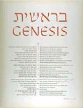
The basic trick, here demonstrated by Ismar David's stunning page of Genesis, is to have the Hebrew and English start from a near-common point on the page (slightly off-center: note that the two languages tend to take up different average lengths. I tend to start with 45%/55% with about a 1/4" margin between the two, and then see what works best with my text for fewest linebreaks).
It is common with songsheets to include both translation and transliteration. If I have a wide enough page (that is, if I can divide the page into three columns without causing too many lines to turn over) I like to do all three in order of Hebrew:Transliteration:English. That puts the transliteration closest to the Hebrew. Note that it is very important that the line breaks match: that the Hebrew and Transliteration cover exactly the same words. By keeping the two parallel, it is easiest for readers to skip back and forth if they so desire.
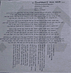 This method has the disadvantage of putting the translation farthest away. I accept this because most song or text translations are not literal, and so start off less parallel. When space precludes three parallel columns, I will generally center the Translation text block underneath the Hebrew/Transliteration. This helps keep the three text blocks (Hebrew, Transliteration, Translation) visually separate. If the material is a song, I will keep verses together. Here is an example used by the Klezmatics on an old album in which they generally follow these principles (albeit, they use the entire song as a text block, rather than verse:verse), and add their own innovative twist.
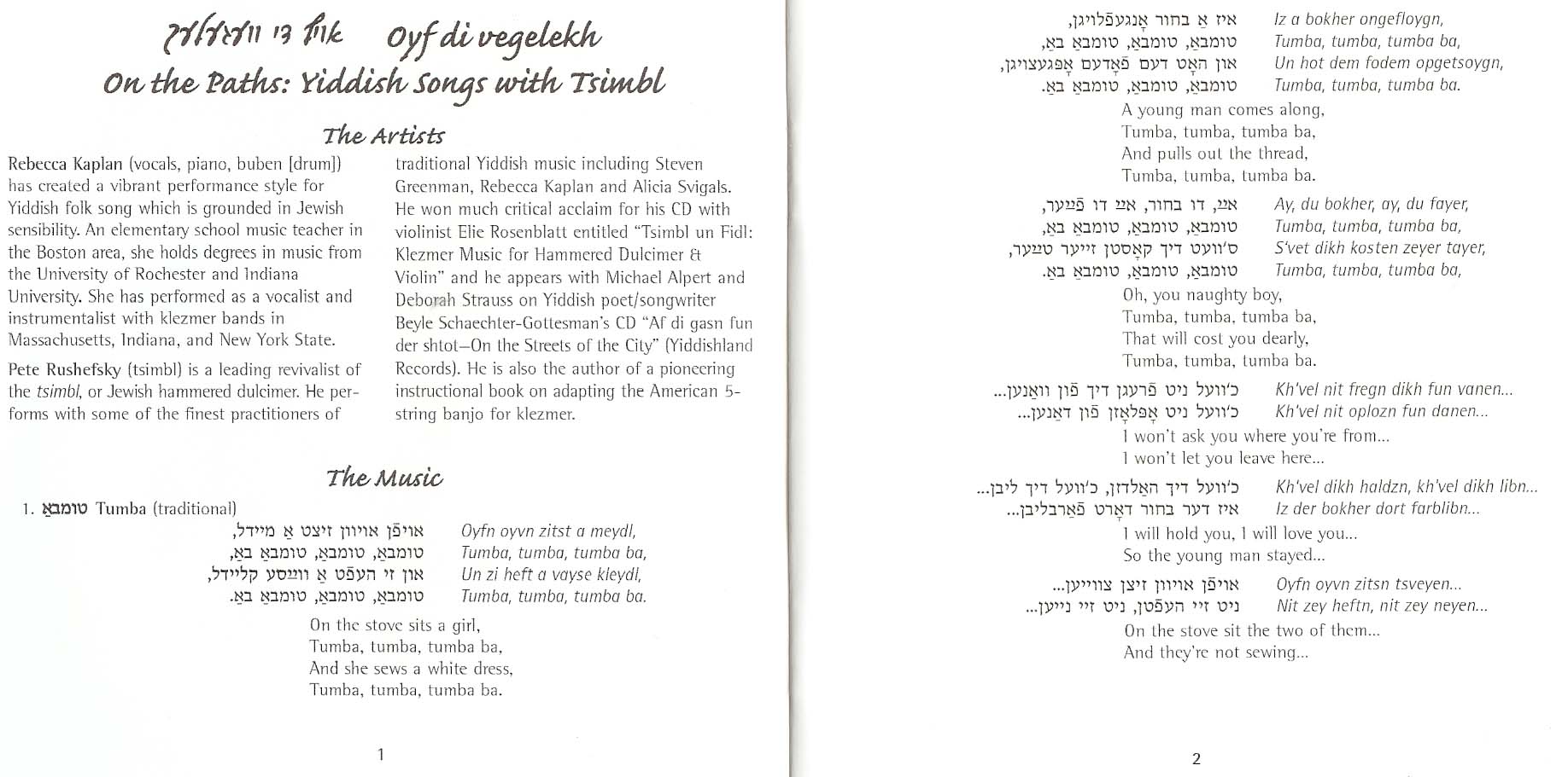
And, alternately, here is a recent spread, showing both two-column English text, and song lyrics in Hebrew:Transliteration, with a centered block of translation, verse by verse, that I did for recent CD notes:
Song Sheets
Most of the principles described above apply to text song sheets with no modification. The largest difference is that when working on a letter- or A4-sized sheet, there is usually room for a third column, if desired.
The difficulty arises when one prints music to Yiddish or Hebrew songs. Over the years, I have noticed two general trends:
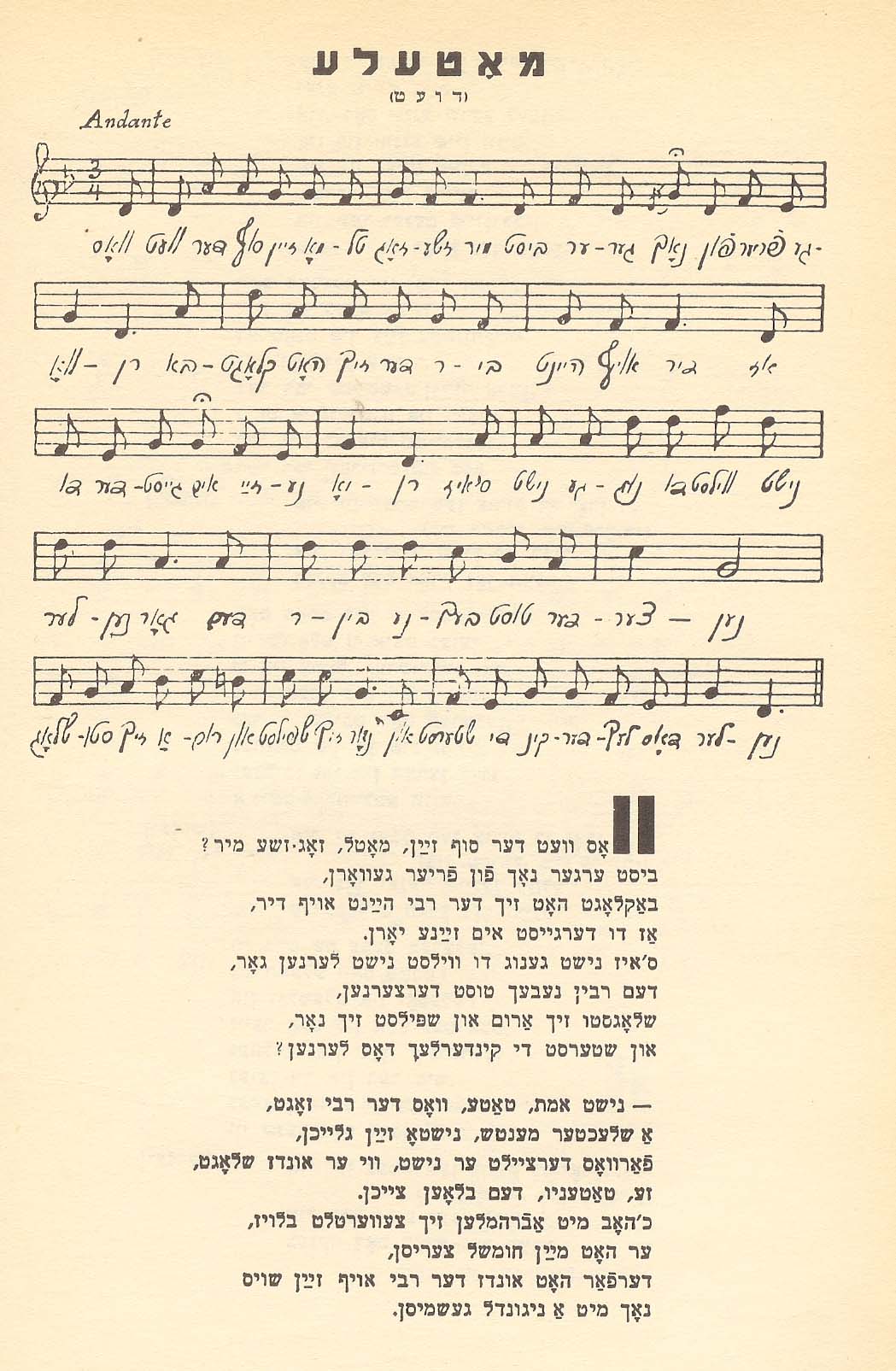
- If the music is printed in Yiddish or Hebrew for a native-speaking population, it is quite easy to break up the words syllabically, and to present them, in Hebrew, under the music. Although this means that the singer is reading music in one direction, and the words to be sung in another, native speakers have little trouble decoding this in practice. It is no different from the problem caused by the fact that numbers in Hebrew or Yiddish are printed from left to right, just as in Latin-based languages. The primary issue is to never print the Hebrew backwards, as this will confuse your native readers, and thoroughly confuse any non-native readers who will have an extremely difficult time putting everything together.
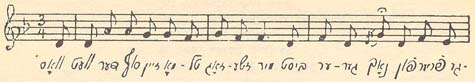
- But what happens when you want to help non-native Hebrew- or Yiddish speakers, as is more common in singing circles outside of, say, Israel or Williamsburg? The innovation that seems to make the most sense, and seems to work best, is to put transliterated text with the music, and to have the Hebrew or Yiddish text (with or without translation) below. This makes it easiest for the singer, while singing, without denying the reader access to the actual Hebrew or Yiddish, possibly with translation in a parallel column. (Note that this sample page has been slightly doctored to match intended typography.)
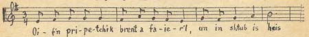
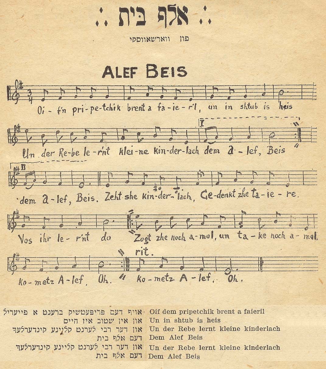
In practice, of course, most often the music is guiding the singer over one verse and chorus, with all of the verses printed below, or on facing pages.
Thank you for visiting: http://www.klezmershack.com/hebrew/hebeng_tips/
Copyright © 2004 by Ari Davidow, ari@ivritype.com. All rights reserved. Last revised Nov 27, 2006.
 | The Hebrew Typography pages are sponsored by FontWorld, featuring Middle Eastern editions of Adobe-ME software, including InDesign-ME, PhotoShop-ME, Acrobat Pro-ME, and the NEW Adobe Illustrator-ME. www.fontworld.com/arabic/adobeme.html. |