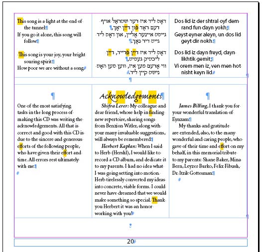
 I was typesetting a new Yiddish CD. The song lines were relatively short, so I decided to set English, Yiddish, and transliteration all parallel. My idea was that even if every line turned over, I would still be slightly ahead of what happens when I set, say, Yiddish+translation, plus the same number of lines underneath, padded by a bit of space, for the translation. A bit dense (and not something I'm likely to repeat), but overall, it worked well. I also thought I'd see how I felt about putting the English on the left of the Hebrew. I do see how I feel—I don't like it, even in a layout this dense.
And, as you'll see, I managed to get into big layout trouble, despite InDesign generally making this sort of work easier than any other tool I've ever used. (Yes, in part this means that tools for doing multi-lingual typography has generally sucked big-time.)
If you are working with InDesign, the way to do this reasonably is to set up a table template with the columns you like, save that someplace convenient. (I would have thought it would fit in the library, but when I took a brief glance at the library it seemed to be for other elements, not table-like things. So, I save it in a file called something like "myproject.ephemera" to go with the other "my project" files.)
The other reason to save the tables, of course, is that if you are a reasonable designer, you have turned off all of the stupid rules (in most cases—somewhere, there is always an exception) which are turned on by default. (Jan Tschichold used to note that the use of rules on a table was a sign that something was designed poorly.) and properly set the default stylesheet and paragraph direction for each column. You don't want to have to proofread that more than once per project.
The first tricky part in doing this is to note that InDesign doesn't know how to break a table between pages. If you are working with song lyrics, that means that best practice means that you simply make all of your tables one row deep—each verse is its own table. That lets you insert page breaks as is convenient, and isn't toooooo bad when you adjust the space between verses to enable a particularly tight situation to work. If you are working on a prayer book or something where a paragraph can be longer, be prepared to have some tables contain half of a paragraph, and to manually move text back and forth when edits cause change. Not so fun. But I don't think that any common editors, from Nisus or Word, understand the desirability of being able to allow a table row (if only InDesign were only that limited) between pages. It's just not something that comes up unless you are setting this type of multilingual text, I suspect.
People looking at the sample page that I have put online here will note that I ignored some best practice and used multi-verse columns for parts of this project—knowing better doesn't mean that I can be deterred from quick and dirty, at least some times.
There were a few stretches of English-only - the musician bios and the like. For various reasons, I first set those in my usual (for CD work) two columns. Remember that you don't want to set CD liner notes in one column because at the usual CD text sizes, you end up with lines that are too long to follow: the human eye does about three stretches of 20 characters in text size before you begin to lose track of what line you are reading. That situation will almost always arise if you set one-column CD liner notes.
What wasn't so smart was that I decided to set those English-only two-column bits in regular columns, not tables. This is a natural thought, since that allows text to flow between columns and makes justification and column make-up much simpler than having to manually adjust columns as you would in a table. As you might guess, the combination of changing page columns and awkward tables meant that when the design changed, I had to simply open a new file and page from scratch. In the event, I moved the English to three columns, as well, for design consistency, but used tables 2nd time out. Slightly painful for layout; significantly saner when it comes time (as it may well come) to move the song order and booklet pagination, yet again.
Anyway, the big lessons are (a) use tables for multi-lingual text, don't use columns—this is especially true since in most cases your columns won't be of equal width: Hebrew takes less width than Yiddish; both take less width than transliteration and translation is often in-between the two, yielding percentages of something like "33% for the translation; 27% for the Hebrew; 40% for the transliteration"—adjust as needed to fit the specifics of your text, your language, and (b) don't mix tables and columns in the same document. Bad things will happen and you'll end up starting the layout over from scratch.